

Which abstract artwork should you choose for your living room?

You like several abstract artworks but are not sure which will work in your living room. Without a landscape or figure to guide the choice, colours often attract attention first. Yet movement and the space left empty matter too.
To compare the images, look at what each brings to the room: a quiet area, contrast or rhythm. We start with four actual prints and a comparison of wall colours to give you practical points of reference.
Look at the large shapes before the small details
Open an image from the Abstract collection, then reduce its size on your screen. What remains readable often corresponds to the main shapes: a dark arch, a light area or a patch of colour. This first look helps you understand its presence from a distance. You may love an artwork for its details and find it much more strongly contrasted when viewed from the sofa.
Geometric prints offer more regular lines and shapes; minimalist compositions give more space to a few elements. These are not different levels of quality. Simply ask whether your living room needs a motif that draws the gaze together or a lighter image among furniture that already has a strong presence.
Compare four different presences on the wall
Deep shapes combines navy blue arches on a beige background: contrast and large curves structure the image. The sun behind the curves brings together cream ribbons, a brick-coloured disc and olive and ochre shapes. The eye moves more between its elements. The first choice gives a more concentrated presence; the second provides a more varied design to explore.
The grain of the stone uses mineral shapes and grains of different sizes within a brown palette. The movement of the patches places organic colour blocks, stripes and marks side by side. Brown prints or terracotta prints let you compare these colour families. The texture depicted belongs to the printed drawing: it does not mean the paper has the relief of stone or canvas.
 Deep shapesView the print
 The sun behind the curvesView the print
 The grain of the stoneView the print
 The movement of the patchesView the print
Observe the same blue on two backgrounds
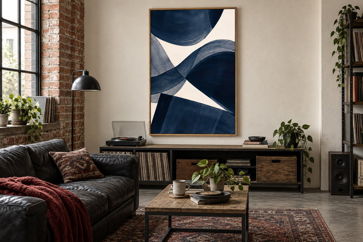
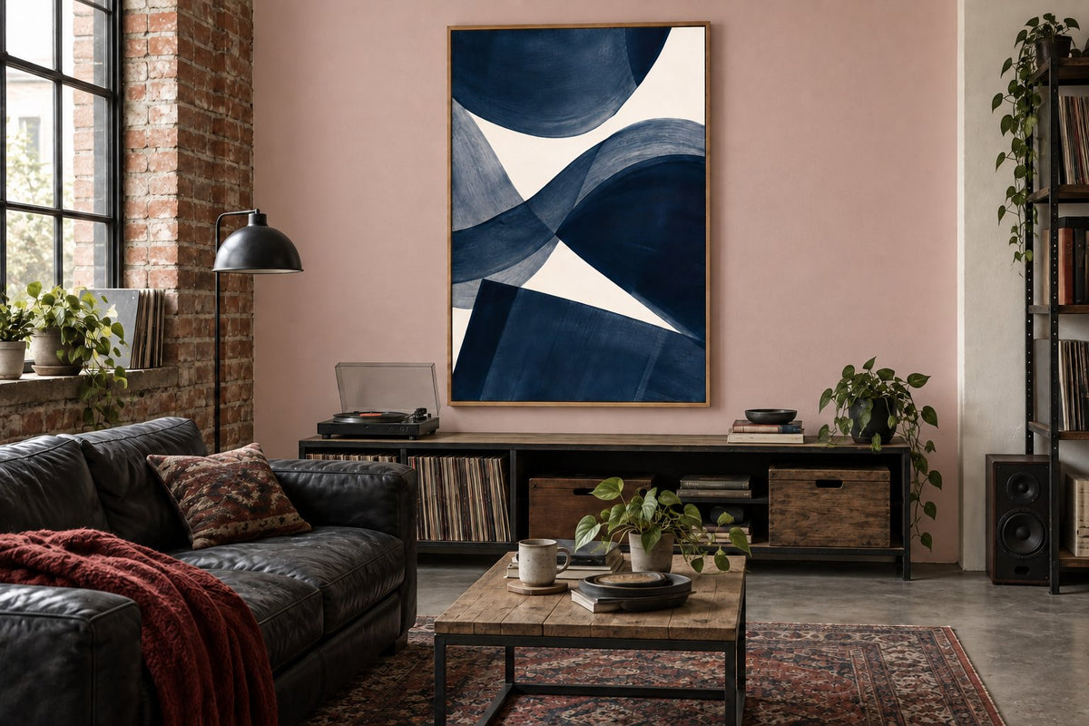
The room visualisations keep the print with navy shapes, its frame and the same decor. On a cream wall, the image's beige background stays close to the room's colour: the dark arches become its main accent. On the pink wall, the print's rectangle stands out more. The composition has not changed, but its visual boundary and colour combination have a stronger presence.
This comparison shows why a colour you like on its own deserves to be viewed in context. Blue prints can echo an armchair or contrast with a warm wall. Beige prints can accompany a softer interior. Try a paint sample if you plan to change the wall, and allow for the difference between inspiration on a screen and the actual colour.
Choose a direction that responds to the furniture
Look at the lines in your living room: a low sideboard, vertical shelves or a round table. A curve in the print can echo the table; a composition of bands can respond to the furniture. Living room prints present these directions through very different subjects. Abstraction lets you focus on that relationship without needing to find an identical object within the image.
One connection is enough. If the furniture, rug and artwork repeat exactly the same curves, the result can become predictable. Keep a difference in scale or rhythm. An image with rounded shapes can work very well with angular furniture. Compare both possibilities and keep the one where the artwork remains distinctive, rather than trying to match every line.
Adapt the level of detail to the existing decor
A print with many marks and small patterns needs an area where those details remain clear. If wallpaper or a bookcase already occupies the entire wall, a simpler composition may be preferable. Black and white prints reduce the number of colours, but their drawing can still be dense: always examine the shapes as well as the palette.
Conversely, a very plain living room can welcome an artwork rich in visual textures. Painterly prints open up that choice. For a compact room, the guide to small living room walls helps you prioritise the available areas. Detailed images are not reserved for large rooms; they need a place where they can be understood.
Check the artwork's size and outline
Prepare a template matching your chosen frame's outer dimensions and view it from the main seats. Strong contrast can feel very prominent even in a modest-sized print. A landscape-format composition suits available width; a portrait-format image creates a different relationship between the top and bottom of the wall. Respect the original drawing when making your choice.
The frame adds another line to the composition. A black outline can extend a dark shape; light wood can bring the image closer to the furniture. Consult the frames and hanging accessories before measuring the whole piece. For a large clear surface, our guide to decorating a large wall explores height, viewing distance and the space around the artwork.
Keep an image you will enjoy looking at
Compare your two favourites by naming what you like: the dominant colour, movement, small details or simplicity. You do not need to assign a meaning to the drawing to appreciate it. Then keep the one that works with your light and current furniture, even if it does not repeat every colour in your living room.
Affichely paper prints are made to order in Fayence on 270 gsm semi-matte photo paper with pigment inks. Check the formats and frames available on your chosen image's product page. Choosing becomes easier once you have decided the artwork's role: creating contrast, adding movement or establishing a quieter area on the wall.
Choose your abstract composition
Curves, colours and visual textures to compare for your living room
Discover abstract artworksAn abstract composition you enjoy every day.
Discover abstract artworks

