

How do you decorate a large wall without scattering the artwork?

A large empty wall makes you want to choose a very large artwork immediately. Yet its length may serve several uses: the living room, a dining area, a console or a passage.
Before filling that surface, decide which part should form a composition. Here is how to connect images with furniture, choose their orientation and keep the arrangement clear.
Divide the wall according to the room's uses
Stand far enough away to see the entire wall. Which pieces of furniture are in front of it? A sofa and dining table can create two areas even without a partition. The artwork can accompany one of these areas rather than the wall's geometric centre. Landscape-format prints offer a horizontal direction to compare with these arrangements.
A free surface above low furniture does not read like one beside a passage. In the first, the image can become a focal point; in the second, a sequence can accompany movement. Living room wall art and hallway wall art let you begin with actual use before choosing a style or number of frames.
Four horizontal images to establish a direction
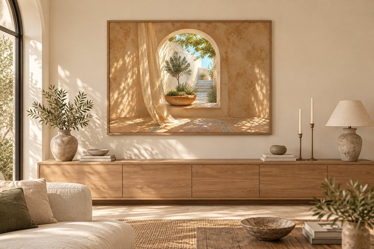
Archway Over the Olive Garden (Landscape) opens an arch onto an olive garden. The aperitif, evening shapes (Landscape) creates an aperitif scene using shapes and colours. Dance at sunset (Landscape) gives space to a dance at sunset. Silhouette in a Wide-Brimmed Hat presents a silhouette in a wide-brimmed hat. These designs are selected in their landscape orientation, which is part of their composition and requires no improvised cropping.
A horizontal subject can accompany a sideboard or sofa, but it does not necessarily have to cover its entire width. Landscapes offer horizon lines; abstract compositions let you work with shapes and colours. Look first at the relationship between the image and furniture, then at the space left on each side of the wall.
 Archway Over the Olive Garden (Landscape)View the print
 The aperitif, evening shapes (Landscape)View the print
 Dance at sunset (Landscape)View the print
 Silhouette in a Wide-Brimmed HatView the print
Cream or clay: give the composition a place
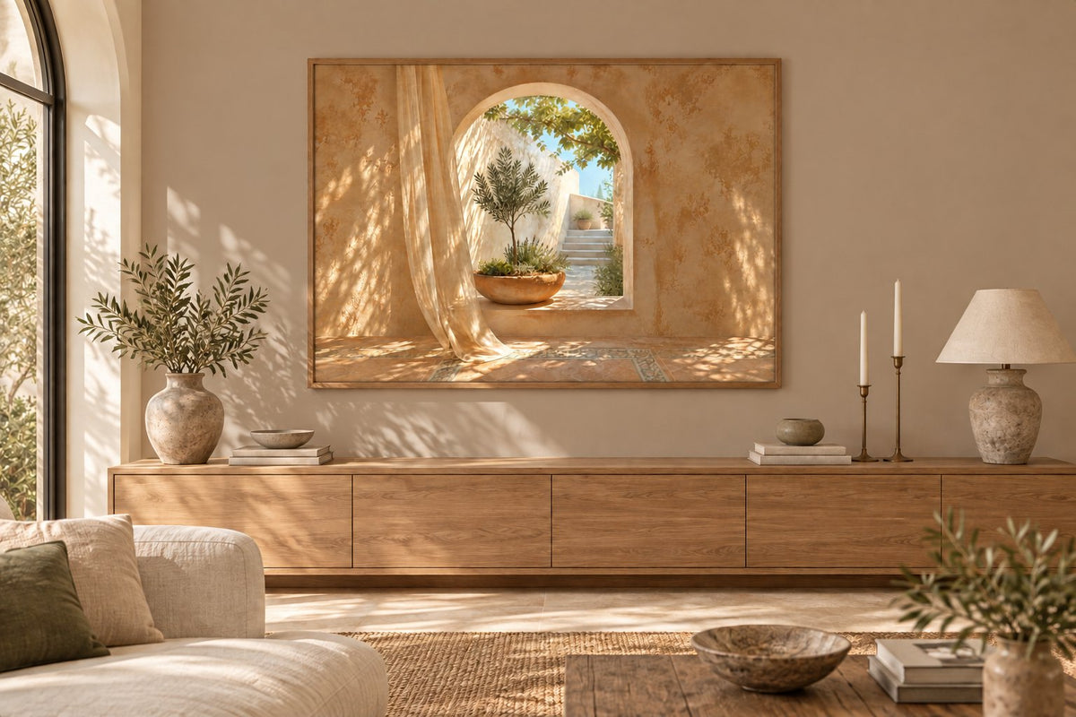
The two room visualisations keep the same horizontal image, frame and furniture. Only the wall colour changes from cream to a clay shade. On cream, the decor forms a light whole. On clay, the print's bright area stands out more and the subject's warm tones find an echo in the room.
Changing the colour does not replace choosing the format, but it can help define an image's presence on a large surface. Beige prints create gentle continuity; terracotta tones give a warmer direction. Test paint with an actual sample, because a screen visualisation does not reproduce your light.
Choose between one image and a group of frames
A single image gives a clear centre and needs little coordination. A group allows several subjects to develop, provided you plan it as a whole. Avoid choosing a frame for every visible gap: distances can become irregular and images appear isolated. A shared line, similar gaps or a readable overall shape helps bring them together.
Botanical prints allow variations around leaves and branches. Travel prints build a more personal story. You can also combine different subjects with the same frame finish. Prepare the group on the floor, then transfer its total dimensions to the wall: it is this complete footprint that needs to be judged alongside the furniture.
Check orientation and dimensions on the product page
Paper print dimensions are offered around the 21 × 30, 30 × 40, 50 × 70 and 70 × 100 cm formats. For a landscape design, check the orientation and the width-height order displayed on its product page. Then add the frame moulding's width to prepare the outer template, rather than inferring a size solely from the onscreen image.
A large wall does not automatically justify the maximum format. Viewing distance and furniture matter just as much. Minimalist prints retain a clear subject from afar, while a detailed image may deserve a closer position. Look at height too: a composition too far from the furniture can seem to float, even if its width looks right.
Connect the areas without repeating every motif
If the wall contains two compositions, give them one clear feature in common. A frame finish or repeated shade is often enough. Green prints can accompany several areas through different subjects; black and white prints create a graphic link. Keep a hierarchy, however: two equally intense groups can compete for attention.
Our bohemian decorating guide helps combine patterns and materials when the wall accompanies a lively living room. The advice on arranging frames on a staircase continues the thinking if the surface extends towards a landing. In each case, first view the composition from the places where you actually pass through or sit.
Check the wall with its everyday objects
Return lamps, plants and objects to the furniture before the final trial. Their height can hide part of an artwork or change a group's balance. Check reflections by day and evening, then door openings. Choose fixings suited to the wall and the frames' total weight, with an accessible, stable hanging method.
Affichely paper prints are made to order in Fayence on 270 gsm semi-matte photo paper with pigment inks. Choose a visual direction, measure the frame or complete group, then confirm its relationship with the furniture. A large wall gains a more convincing composition when each image belongs to a specific area and keeps space around it.
Find an image for your large wall
Landscape compositions to choose according to furniture and viewing distance
View landscape-format printsA clear composition on your large wall.
View landscape-format prints

