

What kind of wall art should you hang in a dining room?

The table is in place and you like the chairs, but the wall still feels a little cold. A picture can connect the room’s colours and make the dining area more welcoming without changing the furniture.
Make the choice from the entrance and from the table. Here is how to find the right wall, choose an image and coordinate it with the sideboard, materials and mealtime lighting.
Look at the picture from seated positions
Sit in several places around the table. A picture clearly visible while standing may disappear behind a pendant light when you sit down. Also look from the kitchen or living room if the spaces connect. Prints for living spaces offer several directions, from quiet drawings to colourful landscapes, to assess from these viewpoints.
The wall above a sideboard is often straightforward to arrange: the furniture provides a visual base and keeps the table free. On a wall without furniture, the image can define the dining area. However, avoid placing it in a spot that doors, the pendant light and chair backs take turns obscuring.
Choose a subject that complements the room
A still life echoes tableware and meals without turning the wall into a menu. Olive prints bring muted greens and light shapes; botanical compositions expand this direction. For a room looking outside, Mediterranean landscapes can extend the feeling of a terrace or sunlight.
Our selection offers four moods. The lemons under the olive branches combines citrus fruit, leaves and light tones; The olive branch in the white jar places a white jar alongside warmer shades. The sun behind the hills simplifies a landscape into large shapes, while Mediterranean Terrace over the Sea opens towards the sea. First compare how they work with the wood and fabrics in your dining room, before deciding on size.
 The lemons under the olive branchesView the print
 The olive branch in the white jarView the print
 The sun behind the hillsView the print
 Mediterranean Terrace over the SeaView the print
Oak or black around the same image?
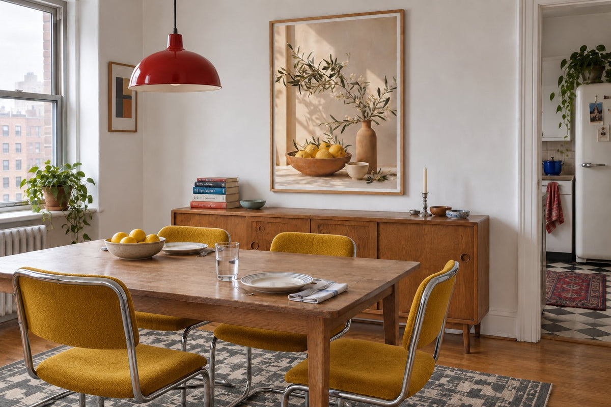
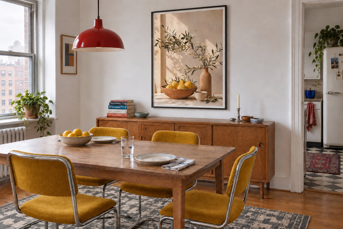
The two simulations show the same dining area with the same lemon print. Only the frame finish changes. Oak complements the table and sideboard, placing the image within a continuous set of materials. Black draws a clearer boundary around the pale paper and makes the arrangement more graphic.
The choice depends on what is already there. Black furniture legs or a dark pendant can find an echo in the frame. If the furniture mixes several woods, a neutral finish can avoid adding another difficult shade to match. Beige prints support a gentle combination; black-and-white compositions strengthen a more deliberate contrast.
Relate the picture to the table or sideboard
Above a sideboard, start by centring the picture on the furniture, then adjust if a lamp or tall vase adds visual weight to one side. You do not need to fill the entire width. A landscape-format print follows the top’s horizontal line; a portrait leaves more space for accompanying objects.
On a clear wall beside a round table, a large print can become the main point of reference. Check the space using a template matching the frame’s outside dimensions. The 30 × 40, 50 × 70 and 70 × 100 cm paper sizes create different levels of presence; the largest is useful only when the wall and viewing positions give it room.
Build a palette around existing materials
With light oak and off-white seating, a green or blue picture can bring freshness. Explore green prints for a botanical connection and blue prints for a cooler accent. With dark wood, a light area within the picture helps distinguish it from the furniture, particularly under gentle lighting.
If a rug or chairs already bring strong colour, choose just one echo in the picture. Abstract living room prints let you select by shape and colour without adding another theme. Our guide to pairing terracotta with other colours explores cream, green and blue combinations when this shade is already part of your dining area.
Give the dining area its own personality
A dining room can feel sociable without crowding the table with objects. A vintage print complements a second-hand sideboard; an Art Deco composition can respond to curves or a small touch of brass. Choose a direction you enjoy every day, even when the table is not set.
In a room opening onto the kitchen, connect the spaces through colour rather than identical pictures. The guide to creating a coffee nook offers an example on a smaller scale. Different subjects sharing a frame finish or tone distinguish eating from preparation while retaining a sense of unity.
Make the final trial at dinner time
Before hanging, look at the template in the evening with the pendant switched on and the table in normal use. Check that a light does not reflect directly over the subject from your usual seat. Also assess the height from the sideboard: a jug or vase should not hide the part of the picture you chose to attract attention.
Our paper prints are made to order in the Affichely workshop in Fayence on 270 gsm semi-matte photographic paper with pigment inks. The stated size refers to the paper; include the frame dimensions in your trial. A well-positioned image, a palette connected to the furniture and a coherent frame are enough to give the dining area a more personal presence.
An image to complement mealtimes
Compare subjects and colours that suit your living space
Explore the printsFind a picture for your dining area.
Explore the prints

