

What should you hang above an entryway console table?

Your console holds keys, post and perhaps a lamp. The wall above seems available, but an artwork needs to find its place among those objects, the mirror and the doors opening nearby.
When decorating an entryway, the most useful starting point is to view the whole scene from the threshold. Here is how to choose an image, connect it to the console and keep everyday arrivals pleasant.
Choose what catches the eye from the doorway
Enter your home as though seeing it for the first time. Do you notice the console wall, an opening to the living room or the side of a piece of furniture? The main print benefits from occupying a genuinely visible surface. Entryway and hallway wall art offers images that can form this first focal point without needing a large wall.
An open entrance also needs to be viewed from the adjoining room. The image can accompany the living room decor or introduce a colour that appears again further inside. Living room prints are an option when the two spaces relate to each other. If the wall is seen at an angle, start with a composition whose subject remains clear from a distance.
A travel scene, a branch or a graphic pattern
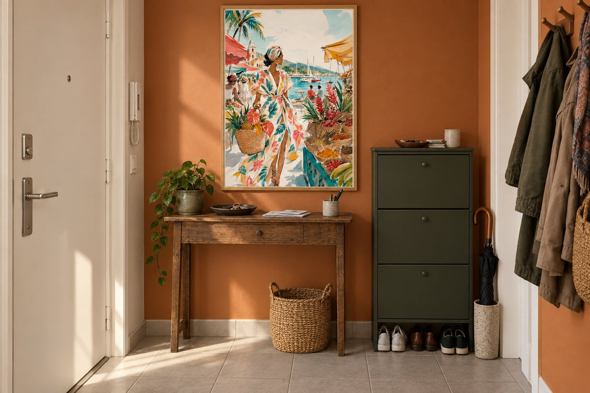
Martinique - Silhouette at the market gives the entrance a colourful scene and a travel memory. The olive branch offers a more discreet branch. Leaves under the crescent combines leaves and a crescent in a decorative composition. The chequerboard ripples adds graphic rhythm with its checkerboard. These four directions let you choose between a storytelling entrance, a botanical one or a more contrasted space.
A console already filled with small objects may work better with a simple image. Conversely, a pared-back piece of furniture leaves room for a detailed scene. Compare travel prints with minimalist compositions while keeping your own furniture in view beside the screen. The best choice also depends on what will remain beneath the frame.
 Martinique - Silhouette at the marketView the print
 The olive branchView the print
 Leaves under the crescentView the print
 The chequerboard ripplesView the print
Oak or black: defining the image's outline
The two room visualisations keep the same entryway, console and print. Only the frame finish changes. Oak accompanies the furniture's wood and softens the transition to the wall. Black traces a sharper outline and gives the image a graphic presence, even though its format remains identical.
Look at the handles, lamp and mirror before deciding. A black frame can repeat an existing line; a wooden frame can continue a material. Black and white prints emphasise a graphic direction. Botanical images offer softer motifs when the furniture already has several strongly defined lines.

Make an artwork and mirror work together
If you use the mirror every morning, start by giving it a practical position. The artwork can move to the side or onto a neighbouring section of wall. Avoid centring each object separately over the console: you would create two competing compositions. Instead, see the mirror, frame and lamp as one arrangement, with a main area and a lighter area.
A large mirror may also occupy the entire wall above the furniture. In that case, the print sometimes finds a better place opposite or on the adjoining wall. Check what the mirror reflects: an image can appear in it without being directly visible. Portrait-format prints work particularly well on the narrow sections left beside it.
Measure with the lamp and key tray in place
Put the objects you use every day on the console before preparing the frame template. A tall lamp can hide a corner of the image; a bouquet can conceal the subject. Format is therefore not chosen solely from the furniture's width. Keep a visible gap between the objects and the bottom of the frame, then check the scene from the doorway.
Compare paper formats of 21 × 30, 30 × 40, 50 × 70 and 70 × 100 cm according to the actual space. Include the frame's outer dimensions in your trial. Landscape-format prints can accompany a long console; a portrait more easily leaves one side free for the lamp. Open the doors too before fixing anything in place.
Connect the entrance with your interior palette
A colour already present in the floor or rug can provide a link. Beige prints accompany light materials, while green prints echo a plant or painted joinery. You can also keep the wall neutral and let the image provide the entrance's main colour accent.
The guide to decorating a staircase with frames continues this thinking if the entrance opens onto stairs. For a compact adjoining living space, our advice on choosing artwork for a small living room explains how to keep a clear focal point. A shared frame finish can connect the rooms without repeating every print.
Check the light and everyday movements
Look at the wall under evening lighting: this is often what welcomes you home. If a reflection hides the subject, try a slightly different position before hanging it. Keep the frame away from doors, bags and coats. A fixing suited to the wall material and total weight is preferable to a picture simply resting on a frequently used console.
Affichely paper prints are made to order in Fayence on 270 gsm semi-matte photo paper with pigment inks. Choose the design for its subject, then confirm the space it needs with the frame. A successful entrance keeps its practical uses while offering, from the threshold, a glimpse of the colours and images you enjoy coming home to.
A picture to welcome you home
Choose artwork that finds its place with your console and colours
View entryway wall artMake room for an image at the entrance.
View entryway wall art

