

Autumn colours: how can you use Little Greene's new shades?

A new colour card often makes you want to repaint. Yet the shade that catches your eye on a small swatch is not necessarily the one you want across four walls. Between the sofa you already own, the flooring and the evening light, your room deserves an approach that reflects its own character.
Little Greene is refreshing its Colours of England and Colour Scales collections in September 2026. Here is what this news could inspire at home, followed by a way to move from curiosity to a personal choice. The combinations below are our decorative interpretations, to try in your own interior.
What is changing in the September colour card
The brand announces a refreshed colour card with 26 new shades, available from 14 September 2026. Its presentation includes Ashes of Marigold, a muted orange, and Floss, a confident pink. The collections combine new colours with graduated shades: details appear in Little Greene's official announcement.
This launch is a manufacturer's proposal, not a list of compulsory colours for the season. You might take away the idea of a stronger pink, prefer an intermediate shade or change nothing. Decorating news becomes useful when it helps clarify your taste instead of replacing a setting you still enjoy.
Before choosing a paint reference, collect a few pictures of rooms you like. Notice what actually recurs: a coloured door, a contrast with metal, a ceiling that differs from the walls? That detail can be worth more than recreating an entire collection without considering your home.
Begin with the colours that are staying
The floor is often the largest surface you will keep. Amber-toned boards, grey tiles and reddish-brown terracotta each have a different relationship with paint. Place your first ideas beside the floor, then beside the largest piece of furniture, before looking at accessories.
Also consider elements that are harder to move: doors, radiators, worktops or curtains you have already chosen. The aim is not to find a paint that exactly matches every one. Instead, decide what you want to emphasise and what you would rather give a quieter role.
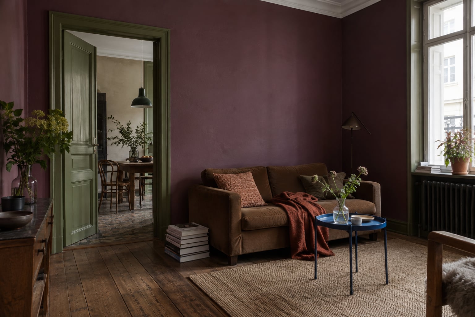
In a living room with a blue sofa, a strong pink can become a deliberate contrast. Alongside dark wood, a muted orange can create a more enveloping combination. Keep a sample beside the seating and view the pairing from the doorway: this perspective helps you judge your room's proportions.
Choose the surface before the intensity
A colour does not have the same presence on a door as on the wall you look at all evening. If you are unsure, start by defining its role. Do you want to mark out a reading corner, highlight an alcove or change the overall atmosphere? The surface follows that intention.
A small, strongly coloured area is not automatically quieter than a whole wall. A bright door in a pale hallway can immediately draw the eye. Conversely, a deep shade across several surfaces can create a continuous background. Decide what should become the point of attention.
Keep the route between rooms in mind too. Several colours may be visible together from the entrance, even if they belong to separate spaces. Open the doors, step back and look at this overall view before choosing a colour for each room as though it existed in isolation.
Let materials work alongside colour
Paint need not be accompanied only by matching cushions. Try a relationship between materials: smooth metal and woven fabric, dark wood and clear glass, a matt surface and a glossy object. These differences add detail without requiring a new colour for every accessory.
A strong pink can accompany a steel table and an old armchair. A muted orange can converse with deep blue, a black chair or an irregular ceramic piece. Keep the objects you love: their presence prevents the room from looking like one complete range purchased on the same day.
For an already warm palette, the guide to combining terracotta in a living room helps compare different directions. The approach is the same here: choose a principal combination, then notice the differences, without trying to make every piece of furniture or book conform to the dominant colour.

Test in the light you live with
An image on a screen helps identify an idea; it cannot confirm an exact shade. The manufacturer recommends viewing samples at home and notes that the appearance of its colours changes with the light in its guide to using sample pots.
Position your test where the paint will go, then look at it at different times of day and with the lamps you actually use. Compare candidate colours under the same conditions. A small test kept beside a window does not answer the question of a wall at the back of the living room.
Allow time to live with the proposal. Look at it as you pass, from the table and from the sofa, without constantly trying to make a decision. If a colour appeals mainly in a tightly framed photograph but less in everyday views of the room, reduce its presence or try another shade.
Build on the change without replacing everything
Once you have chosen the colour, put your existing furniture and objects back first. Paint may be enough to change their presence. Move a lamp, swap two textiles between rooms and see what is genuinely missing before making a shopping list. Some differences become more interesting against the new background.
If you then want to add an image, the guide wall colours: which print should you choose? takes the idea further. A print becomes one possibility alongside a mirror, a shelf or simply an empty wall. Not every surface needs a new object.
Perhaps the best use of something new is to understand more clearly what you want to keep. A bright colour can remain an accent; a softer shade can become the principal background. The colour card opens possibilities. Your light, furniture and the way you use the room help you choose between them.


