

How do you coordinate a black and white print with your wall?

You like a black and white picture, but are unsure where it belongs in a colourful room. Its background, dark areas and distance from the furniture matter as much as the absence of colour.
Here is how to compare the wall, frame finish and size. Three visualisations show the same arrangement against different backgrounds before you try it at home.
Look at the contrast between the picture and wall
A black and white print keeps its image, but how you perceive it depends on its surroundings and the light. A large white background, subtle greys and a solid black area stand out differently. Start by identifying their proportions in the picture you like.
The following visualisations show the same three prints and frames in the same room. Only the wall colour changes. They illustrate a decorative relationship; they do not predict the exact shade of your paint or print under your lamps.
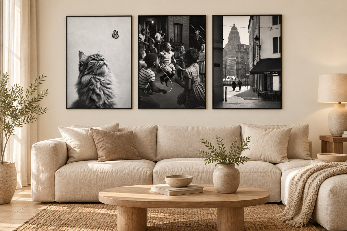
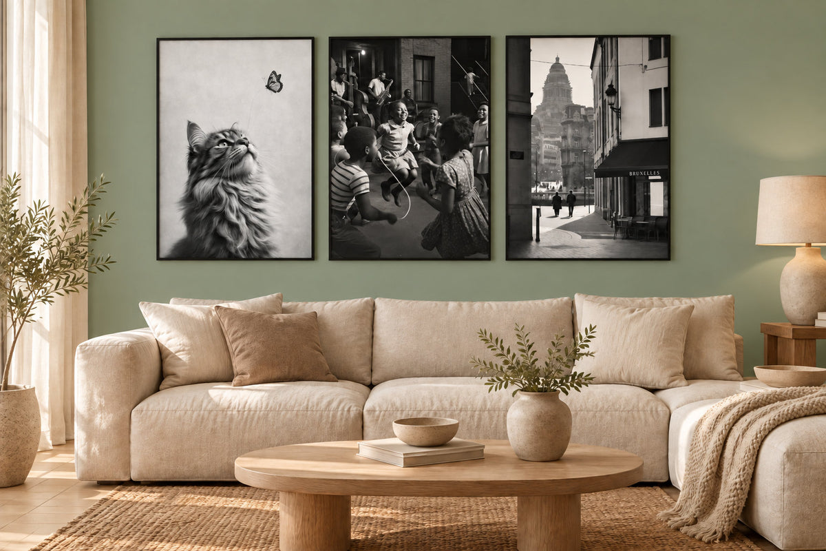
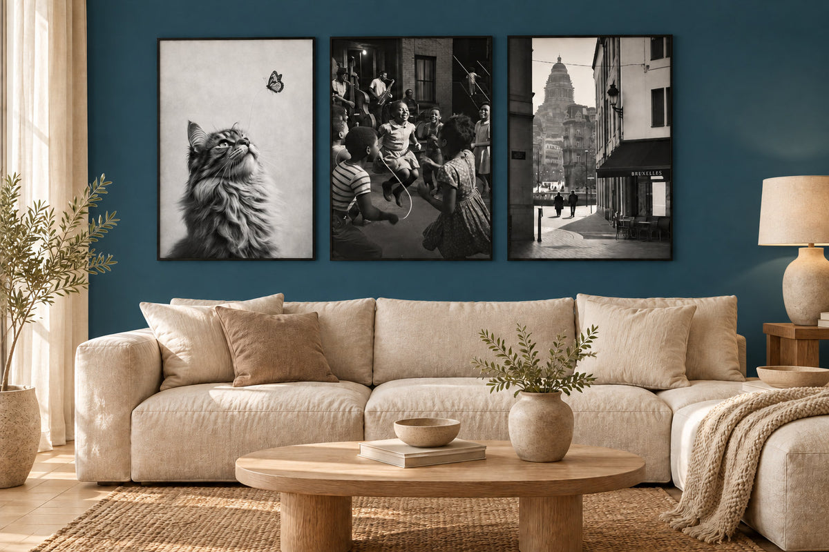
On a light, warm wall
An off-white, linen or cream wall can accompany wooden furniture and natural textiles. A light picture feels closer to it, while a dark frame maintains a separation. Consider whether you want that continuity or would prefer the picture to become a more pronounced focal point.
For more presence, compare a picture with a distinct shadow or dark subject. Photographic prints and architectural prints offer different densities. Then try the size on the wall: enlarging is useful only if the space and viewing distance genuinely make the subject easier to see.
On a muted colour
Sage green, greige or grey-blue provides a coloured background without necessarily dominating the whole room. Compare a sample with the picture and textiles. White may seem more visible against this background, but the result also depends on the contrast within the print.
To bring different subjects together, look for similarities in backgrounds, crops or outlines. A portrait, a picture from the Women collection and a cat print can relate to one another. Look at them together: the wall colour alone cannot create their coherence.
How do you choose an animal portrait?
For an animal, the crop matters as much as the subject. A close-up portrait emphasises the gaze; a whole silhouette gives more room to the landscape. Compare lion prints, tiger prints and elephant prints, then choose a monochrome picture with a background that suits your wall.
In a pair, connect the pictures through their background brightness or subject size. Similar crops give a regular rhythm. A dark close-up and a small silhouette on a light background create more contrast: that difference can also be a deliberate choice.
On a dark wall
Against petrol blue, forest green or charcoal, a white area becomes more visible through contrast. An almost black scene may instead feel closer to the wall. Examine the entire picture, instead of choosing solely by its subject or a small screen thumbnail.
A light border or mount, if included, also changes the bright area around the subject. Check what belongs to the picture and what is part of the frame. Minimalist prints and line art offer open backgrounds, but a photograph with a pale sky can serve the same purpose.
Does everything need to be black and white?
You can combine colour with black and white. A vivid picture often attracts attention sooner: place it at the centre of the group if you want it to play that role. A colour already present in a rug or cushion creates an additional connection, without being a requirement.
Display the pictures together before hanging them. If a composition feels unbalanced, try moving a print, reducing the group or using matching frames. The decision can be about arrangement rather than replacing a subject you enjoy.
Choose the outline alongside the furniture
A black frame draws a strong boundary on a light wall and can become more discreet against dark paint. Oak echoes wood; white can connect with joinery. Compare these options with nearby lamps, shelves and visible furniture legs.
Matching frames help bring several subjects together. Different finishes are still possible if another connection organises the arrangement. Our gallery wall guide explains alignments and floor-based trials, adding up external dimensions and the spaces between pictures.
Adapt the size to the room
In a living room, compare a large picture with a series against the furniture's width. In a bedroom, look at the bedding colours and view from the bed. In a study, choose a position where the subject remains visible around screens and shelves.
A hallway can accommodate a series or a single print on an unobstructed wall. Grey prints let you compare a more nuanced palette. Try the paper sizes 21x30, 30x40, 50x70 and 70x100 using templates, respecting each picture's orientation and the space occupied by its frame.
Our paper prints are made to order in Fayence on 270 gsm semi-matt photographic paper with pigment inks. Check the frame's reflections under your lamps and opposite windows. The paper finish contributes to the result but does not replace this check from your usual viewpoint.
Black and white prints
Portraits, landscapes and drawings to choose according to your wall's contrast
Explore black and white printsCompare black and white with your wall.
Explore black and white prints

