

How can you decorate a narrow hallway with wall art?

Your hallway connects several rooms, doors take up space and the walls still look empty. Pictures can give it character, provided you first notice what remains visible as you walk through.
One picture at the end, a few along one side, a colour that works with the floor: here is how to choose decoration that makes an impression while keeping the passage clear.
Choose the wall you see as you arrive
Stand at the entrance to the hallway, then walk back the other way. The wall your eye naturally settles on is your first possible position. A print at the end creates a focal point; on a side wall, it accompanies the route. Our hallway wall art offers options for both approaches without imposing a single style.
If the end already contains a glazed door or a cupboard, use the clearest section of side wall. Avoid centring a picture along the entire hallway when doors interrupt that surface. The right centre belongs to the wall space actually available. Also assess a picture near the entrance with coats and bags in their usual places.
Clear shapes at the end, details along the side
From several steps away, a silhouette, a tree or large shapes remain recognisable. Minimalist compositions suit this first glance, as do landscapes and nature scenes with simple main lines. Reserve pictures rich in small details for places where you can comfortably stop and look more closely.
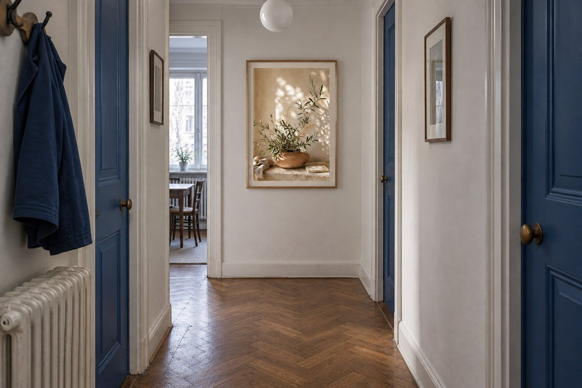
Four practical directions: Olive branch in a bowl, sun shadows picks up beige and light wood; The oasis between the hills brings a colourful sense of openness; The chequerboard ripples adds rhythm through its checkerboard; Leaves under the crescent combines a warm background with a dark botanical motif. Choose the one whose palette you also enjoy, then consider a second image from the same family.
 Olive branch in a bowl, sun shadowsView the print
 The oasis between the hillsView the print
 The chequerboard ripplesView the print
 Leaves under the crescentView the print
A light wall or sage green: see the difference
Our two room simulations keep the print, frame and hallway the same. Only the end wall changes colour. On the light wall, the cream paper blends further into the surroundings. Against sage green, its pale surface stands out: the picture becomes easier to notice from the entrance without changing size.
This comparison helps you choose a relationship between wall and image, rather than a paint colour on a screen. Look at a sample at home, in daylight and under your lamps. Beige prints extend a gentle scheme; green prints can echo a piece of furniture, a door or an existing detail. A frame then defines the transition.

Which size works with limited viewing distance?
Choose the size for the clear section of wall, rather than the floor width alone. In a small gap between doors, start by comparing 21 × 30 and 30 × 40 cm paper sizes. An unobstructed end wall may accommodate 50 × 70, but check the frame’s outside dimensions and the distance from which you will view it.
Cut a template to the outside dimensions of your proposed frame. Attach it temporarily without damaging the paint, open every door and walk through carrying a shoulder bag. The frame should neither obstruct a door nor brush against anyone passing. Landscape-format prints need more width; a portrait can use a narrow section without being placed excessively high.
Several frames: create a simple rhythm
Along a long side wall, two or three pictures can form a sequence. Choose a visible connection: background colour, frame finish or drawing style. Botanical prints let you vary the leaves; abstract shapes offer another kind of continuity without repeating exactly the same subject.
Put all the templates up together before drilling. Align their centres or top edges, then see whether the gaps created by doors still allow the sequence to read clearly. Keep the opposite wall calmer if the passage is tight. Two busy arrangements facing each other can draw attention everywhere and make each individual picture harder to appreciate.
Connect the hallway with adjoining rooms
The hallway does not need to repeat the whole living room scheme. One echo is enough: black frames to accompany door handles, or an earthy shade in a picture that recalls a rug. Black-and-white prints create a graphic line; terracotta tones warm up a combination of cream and wood.
If the doors open onto a light interior, the Scandinavian collection can help guide your choice. Our guide to colours that go with terracotta explores three directions if you are unsure about pairings. The Scandinavian decorating guide explains how to introduce a colourful image into a restrained room, an idea that also works in a hallway.
Check the light and prepare to hang the picture
Observe the position under the lighting you use in the evening. A reflection hiding the subject from the entrance can justify moving the frame a few centimetres. Use a fixing suited to the wall material and total weight; the appropriate method depends on the wall and the manufacturer’s instructions. A slamming door is another reason to check that the hanging is secure.
Affichely paper prints are made to order in Fayence on 270 gsm semi-matte photographic paper with pigment inks. Start with one image, check its size including the frame, then add only the other elements you need. Your hallway gains a deliberate decorative focus while retaining its role as a passage.
Give your hallway character
Choose images for the wall space, colours and viewing distance you have
Explore hallway printsAn image for your hallway.
Explore hallway prints

