

Small living room: which artwork works without crowding the walls?

In a small living room, every piece of furniture stands out and the walls quickly become busy. You want a beautiful image, but not more visual clutter around the sofa, shelves and television.
A well-chosen artwork can give the room a direction. Here is how to find its place, decide its format and keep space around what you enjoy looking at.
Start by choosing one focal point
Look at the living room from the entrance. The television, a bookcase or a window may already draw considerable attention. The artwork does not need to compete with every element: look for a section where it can be seen clearly. Minimalist prints are an option when you want a strong image with few surrounding patterns.
A small living room does not automatically need small frames. A single image with enough presence can be easier to read than several scattered little pictures. Living room wall art lets you compare varied subjects. Start with one main image, then observe the room for a few days before deciding whether other walls really need decorating.
Four images that leave room for the eye
The swimmer out at sea shows a small swimmer in a large expanse of blue. Archway Over the Olive Garden opens onto an olive garden through an arch. Alone under the crescent places a silhouette beneath a crescent in a very pared-back composition. Olive Branch in a Terracotta Niche combines an olive branch with an earth-coloured niche. The spaces around the subject contribute as much to the decor as the central motif.
A large plain area within the image can echo a quiet wall or a plain sofa. Blue prints bring a more assertive colour; beige prints continue a soft base. Choose according to the effect you want and your furniture. A light image does not physically enlarge the room, but it can contribute to a less crowded visual impression.
 The swimmer out at seaView the print
 Archway Over the Olive GardenView the print
 Alone under the crescentView the print
 Olive Branch in a Terracotta NicheView the print
Compare the frame outline in the same room
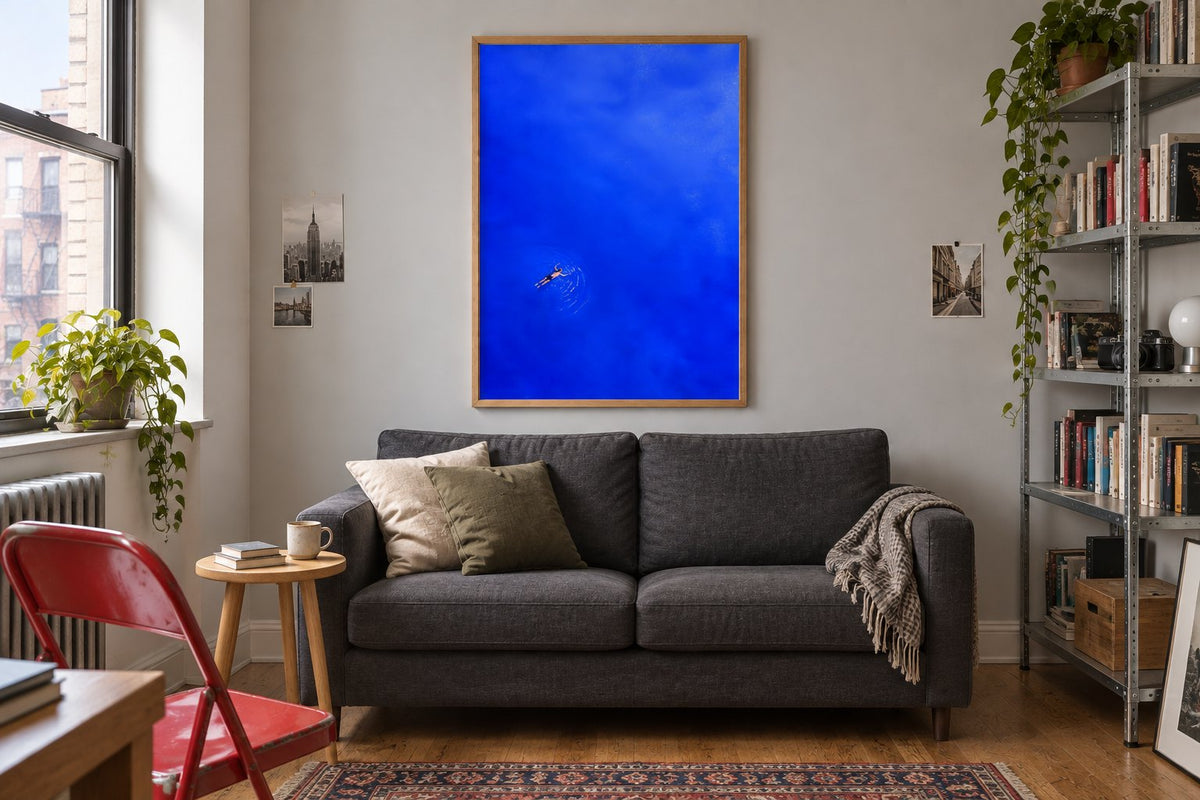
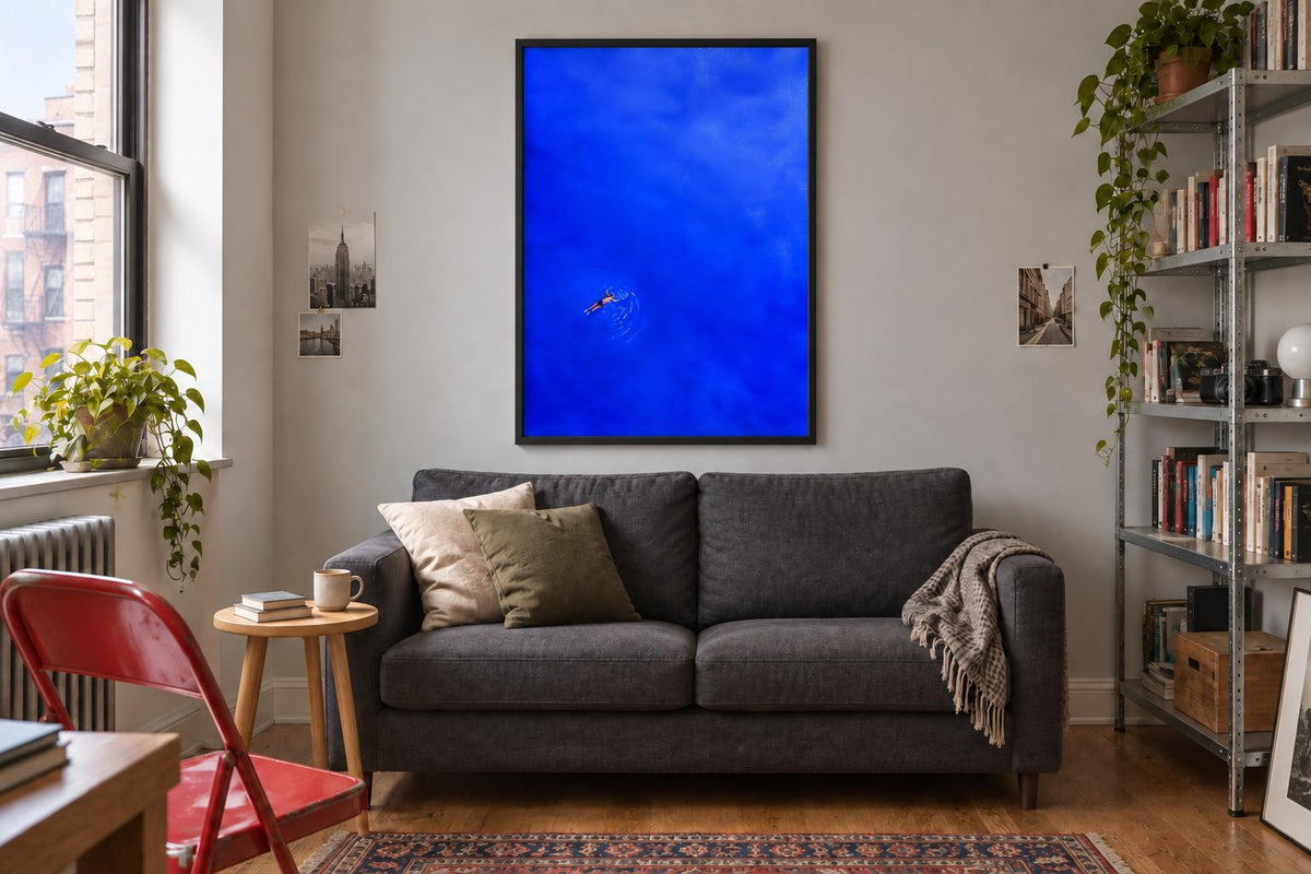
The two room visualisations present the same small living room and swimmer print. The oak frame accompanies natural materials and lets the blue attract attention. The black frame draws a more pronounced boundary around the image. Everything else remains identical, so you can judge the outline's effect without confusing it with a change in size.
If the living room already has a black table or lights, a dark frame can repeat that line. With light wood and linen, oak gives a subtler continuity. Black and white prints reinforce a graphic direction; botanical motifs let you keep a natural subject when you prefer less contrast.
Measure the available section, not just the sofa
The wall may be interrupted by a door, window or shelf. Measure the genuinely clear section and prepare a template matching the frame's outer dimensions. Position it temporarily, then sit in your usual place. An artwork viewed close up also calls for attention to its details and the way its colour occupies your field of vision.
The paper formats offered are 21 × 30, 30 × 40, 50 × 70 and 70 × 100 cm. Compare them without assuming the smallest is always right. Portrait-format prints can use a narrow section. Landscape-format prints suit available width but should not brush against neighbouring elements.
Coordinate the palette with the large surfaces
The floor, sofa and curtains occupy more space than accessories. Repeating one of their colours in the print is often enough to connect it to the decor. You can then add a new shade in a small quantity. Green prints work with plants; terracotta tones accompany warm wood and cream textiles.
Keep an eye on patterns too: an elaborate rug and a full bookcase already provide considerable detail. A print with large shapes can balance that arrangement. Abstract compositions offer different levels of density. Look at a thumbnail of the image, then an enlarged version, to check that you like it from the doorway as well as from the armchair.
Avoid filling every gap
An empty space between two pieces of furniture is not necessarily a gap to fill. It can help distinguish the objects around it. If you choose two frames, group them clearly rather than distributing them at opposite ends of the wall. A shared finish or related palette helps them read as a single composition.
The guide to choosing abstract artwork explains the role of shapes, contrasts and background. If the living room shares space with the entrance, our advice on decorating an entryway with a console helps maintain a link between the areas. The same frame finish may be enough, without repeating details on every wall.
Check the light and keep the arrangement easy to live with
Look at the image under evening lighting and from different seats. A reflection can draw more attention than the subject. Also check circulation when opening a sofa bed or moving a chair. Scandinavian-style prints can guide a clear composition, but the style matters less than how it fits your room and everyday uses.
Affichely paper prints are made to order in Fayence on 270 gsm semi-matte photo paper with pigment inks. Choose one image, test its format with the frame and see how it fits the large surfaces. In a small living room, this considered decision often contributes more than a collection of objects chosen separately as the mood takes you.
Give your artwork a clear place
Compositions to consider alongside your sofa, colours and viewing distance
Discover minimalist printsAn image that finds its place in the living room.
Discover minimalist prints

