

Light and dark wood: how can you combine them in one room?

A pale table arrives in a dining room where the sideboard is almost chocolate brown. The wooden floor has another colour again. Do you really have to choose a side? These differences can give a room depth, provided you look at the furniture together with the floor, walls and light. There is no need to build a collection of identical woods.
Start with the furniture you want to keep. An inherited cupboard, second-hand chairs and a recent table can share a room without belonging to the same era. The following suggestions concern their visual arrangement, not restoration. The images are illustrative interiors: they explore combinations and do not establish the identity of a particular wood or finish.
Start with the wood that occupies the most space
Before comparing two pieces of furniture, look at the floor from the doorway. A large area of exposed wooden flooring contributes more to the palette than a little side table. Simply note its appearance: light or dark, more golden, reddish, brown or grey. If the floor is tiled, its grout lines, patterns and colour still form the background against which the furniture stands out.
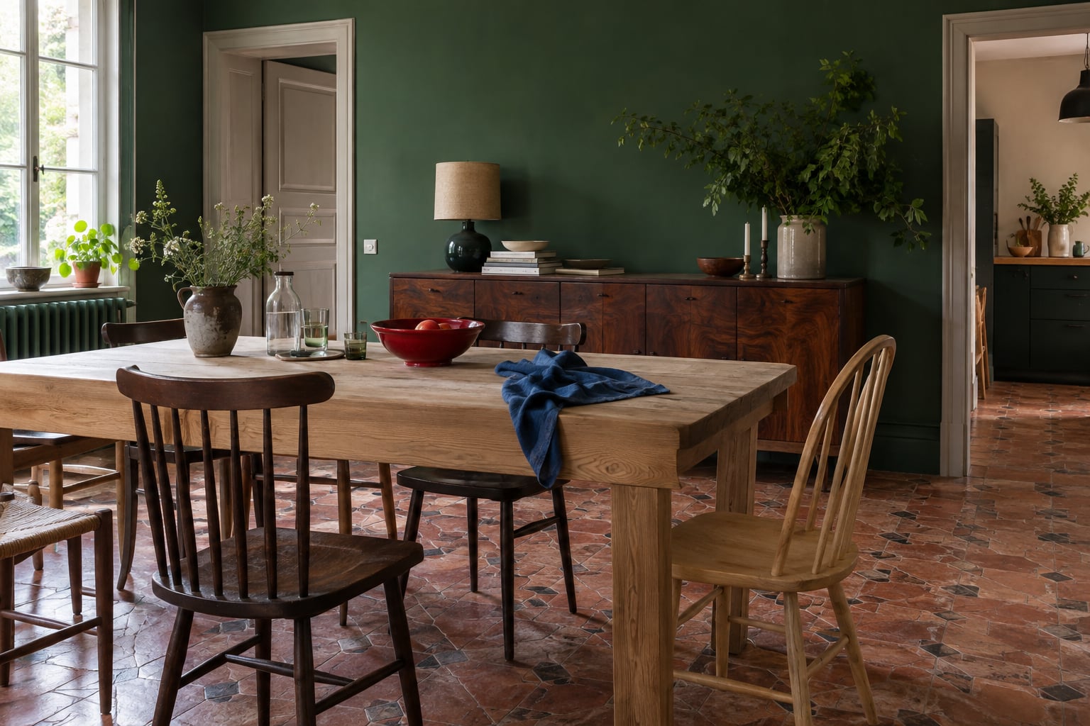
Then make a short list of the elements that will stay: floor, large table, sideboard, bookcase. In our dining room proposal, the pale table and dark sideboard both stand apart from the old floor. There is no need to find a third piece that matches exactly. A strong green wall provides a shared backdrop, while the wooden surfaces retain their differences.
Choose a dominant tone without following a quota
A room can be mostly light and contain a very dark piece. The reverse also works: a pale table can become the bright focus of an interior with deep-toned woodwork. Look at the surfaces that are actually visible rather than counting pieces. A large bookcase can carry more visual weight than four small chairs. Position and lighting change that impression again.
If every element demands equal attention, try moving something first. Bring two pieces with similar tonal values closer together, or clear the top of the sideboard so its outline is easier to read. This is not about meeting a compulsory light-to-dark ratio. The more practical question is this: from your usual seat, do you see a welcoming room or a succession of blocks competing for attention?
Compare undertones in the light of your room
Two pale woods can seem further apart than two pieces with very different colours. One leans yellow, the other pink or grey. Put a chair and a small piece side by side when that is easy; otherwise, photograph them in the same light. Look at larger pieces at different times of day too, because their appearance follows changes in lighting.
A warm undertone does not mean you must exclude a greyish one. If their meeting feels too abrupt, introduce a colour that is already present elsewhere: the blue of a painted chair, a muted red curtain, a green ceramic object. This remains an aesthetic suggestion, not a rule about which wood species are compatible. Avoid identifying a wood or judging its quality by colour alone: the finish also changes its appearance.
Create a connection with textiles and a confident colour
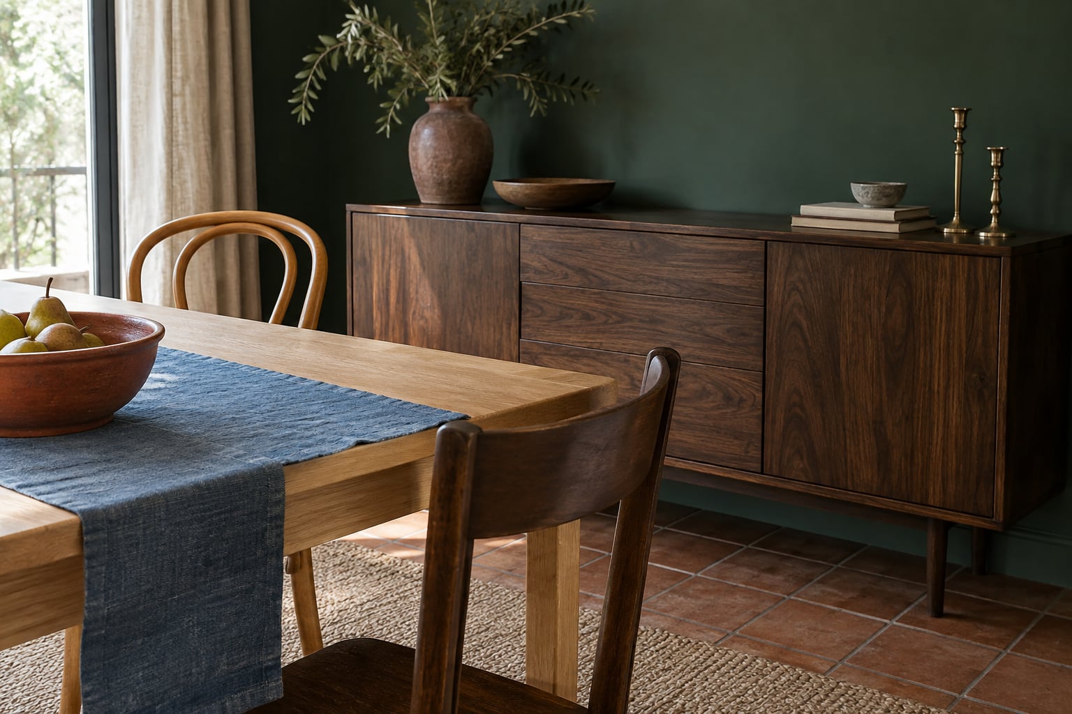
A rug, curtains or a cushion can connect two pieces without imitating their tones. Under a pale table, a textile with brown and blue patterns can echo a dark sideboard while introducing another colour. It can also leave part of the floor exposed: its role is to bring an area together visually, not automatically to hide the floorboards. Compare the arrangement with and without the textile before deciding.
Beige is not compulsory when you want to soften a mixture. Deep green, rich blue or a noticeable pink can provide a coherent background for different woods. If you like earthy shades, our guide to colours that work with terracotta offers other combinations. Keep a clear connection between several elements rather than repeating the same colour across every surface.
Let different styles and signs of age coexist
An old piece does not require everything else to look old. Its decorative legs can respond to the simpler lines of a contemporary table. Mismatched chairs sometimes find common ground in a similar back height, seats of the same colour or a light silhouette. Try just one of these repetitions; piling up every possible similarity can erase what appealed to you about each piece.
Visible marks and differences in finish can also contribute to the arrangement, if you enjoy them. This observation does not replace care or restoration advice: any intervention depends on the piece and its condition. To extend the mix of eras onto the walls, our article on vintage decoration with contemporary furniture considers the choice of images. The furniture can still remain the room’s main subject.
Check the whole room before looking for another piece
Take a first look from the doorway, then a second from the table or sofa. Photograph the whole room to spot what already repeats: three small dark accents, a curved line, the same red in two fabrics. Temporarily remove decorative objects that make the arrangement harder to read. This small clear-out helps distinguish a layout issue from a simple accumulation of things on the furniture.
Then try one change at a time: move a chair, fold back a rug, replace a table runner with a textile you already own. Look again in the room’s usual light. If you like the result, there is no need to make the woods more uniform. A home can retain several tones, furniture from different sources and a few bold contrasts while still feeling connected.


