

How do you build a bohemian interior around your wall art?

Your living room combines a new sofa, a second-hand armchair and a few objects brought home from travels. You enjoy the mix but want a picture that will tie it together. Bohemian decorating can start with exactly what you already own.
The print becomes a meeting point for patterns, materials and colours. Here is how to choose one and make room for it, without buying an entirely matching interior or giving up the objects you love.
Decide what deserves the leading role
Look at your room before browsing bohemian prints. A patterned rug, a large plant or a full bookcase already has considerable visual presence. If you want the artwork to stand out, choose a wall where it can be seen clearly. Above an uncluttered piece of furniture, a detailed image is easier to appreciate than among many small objects.
Bohemian decorating does not require an entirely beige palette. It can include a red flower, a blue landscape or a joyful scene. Travel prints bring a personal story; abstract compositions offer more freedom when combining elements. Start with a subject you will enjoy seeing again, then look for the ways it relates to your home.
Four ways to introduce pattern
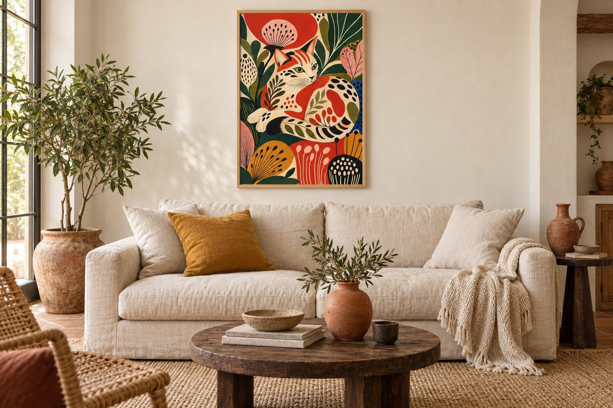
The cat curled among tall poppies brings a cat and large flowers together in a dense composition: the drawing can become the main pattern in the seating area. Mountains in the high sun, by contrast, arranges broad mountain bands beneath an orange sun. Its shapes are easier to read from a distance. Both images offer a colourful presence, but their rhythms differ.
Dancing in the sun, giant flowers introduces people and movement among flowers. The mask of dots centres on an oval shape made of ochre dots. Compare what appeals to you: a scene, a landscape or a repeated graphic pattern. Floral prints and geometric prints let you follow one of these directions without bringing every type of imagery onto the same wall.
 The cat curled among tall poppiesView the print
 Mountains in the high sunView the print
 Dancing in the sun, giant flowersView the print
 The mask of dotsView the print
See what the wall colour changes
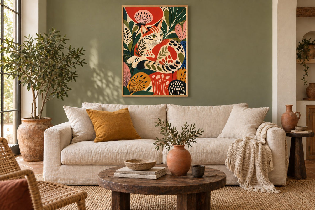
In our two room visualisations, the cat among the poppies keeps the same position, frame and surrounding decor. On the cream wall, the flowers and foliage stand out clearly. Changing to an olive wall brings the paint closer to the colour of the leaves. The image feels more connected to its background, although its red accents remain visible.
This comparison helps you decide the artwork's role. A light background highlights its patterns; a coloured background can extend one of its shades into the room. Green prints offer other possibilities for this relationship. If you keep your current walls, simply repeat the green in a plain cushion, then look at the result before adding anything else.
Mix textiles while leaving a quiet surface
A patterned rug and a floral print can work together. The link becomes clearer when they share a colour while their designs remain different. A large plant motif might echo small stripes through the same red tone. Red prints and orange prints help you find that accent within an image.
Keep a plain surface nearby, such as the sofa seat, a curtain or the adjoining wall. It gives the eye a rest between two detailed areas. You do not need to count every pattern or follow a fixed formula. Step back to your usual seat and check that you can still make out the artwork's subject. A cushion is easier to move than an entire painted wall.
Connect the frame with natural materials
Rattan, linen and wood each have their own pattern. A light wood frame can continue these materials; a black frame can draw a clearer boundary around a busy image. Explore the finishes among our frames and hanging accessories. The choice concerns the artwork's outline, rather than an obligation to match every piece of wood in the room.
A print with a painted texture is still a paper print: it does not replace the relief of a woven piece or a clay object. Painterly prints provide this depiction of texture, while beige prints can calm an already colourful area. Our guide to botanical wall art also explains how to combine plant imagery with a real plant.
Make room for second-hand finds
Place your favourite objects on the furniture, then look at what they hide. A tall lamp in front of a figure's face or a vase in the middle of a landscape interrupts the subject. Move the object first, before hanging the artwork too high. Living room prints should be chosen from the place where you sit as well as from the room's entrance.
A travel souvenir does not have to match the country shown in the print. A colour, a curve or the style of line can be enough to create a connection. If you mainly own older furniture and want to refine the way it works with pictures, the vintage decorating guide explores this approach. The result can remain personal and grow gradually.
Prepare to hang your chosen print
Once you have chosen the image, cut out a template matching the proposed frame's outer dimensions. Place it on the wall, check openings and look at the whole arrangement with the cushions, rug and lamp in position. Portrait-format prints suit a narrow section; another wall may better accommodate a horizontal composition. Always preserve the orientation and design of your chosen artwork.
At Affichely, paper prints are made to order in our Fayence workshop on 270 gsm semi-matte photo paper with pigment inks. Check the format offered on the product page and the matching frame dimensions. You can begin with a single image: its position, pattern and one repeated colour are already enough to give the decor a direction.
A picture for your bohemian home
Landscapes, flowers and patterns to pair with the materials you love
Discover bohemian printsFind the pattern that brings your decor together.
Discover bohemian prints

