

How do you create a coffee nook in your kitchen?

The coffee machine is already there, but cups, packets and accessories are scattered across the worktop. Bringing this small ritual into a dedicated corner can make the kitchen more pleasant without installing another imposing cabinet.
Here is how to choose the location, keep a useful work surface and give the wall personality with a print. A good coffee nook should first suit the way you prepare and enjoy your drink.
Start with your morning routine
Identify what you actually use: the machine or coffee maker, your cup, the coffee and perhaps a grinder. Try the proposed surface before decorating it. You need to open compartments, fill the tank and set down a cup without moving every object. The necessary clearances depend on the appliance and its instructions.
Part of a worktop, a stable trolley or a small sideboard can work depending on the room. Keep the area away from splashes and routes where objects could easily be knocked. Kitchen prints can then connect the nook with the rest of the room once its purpose and location are defined.
Let the wall set the direction
The wall can identify the coffee nook without adding objects to the counter. An illustration of a cup makes an immediate connection; a terrace scene suggests the pause itself. Coffee prints offer both approaches. If you like lettering, choose a typographic composition whose words are readable from where you drink your coffee.
For a gentler mood, vintage kitchen prints work with tins, ceramics and wood. A botanical motif can also suit a preference for freshness rather than the drink itself. Choose one main subject: a print, several signs and slogan-covered accessories can end up telling the same story too many times.
Compare a café scene with a still life
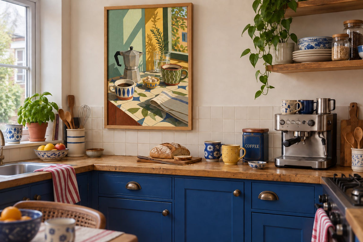
In the first simulation, Morning at the cafe, Morning Note focuses on reading and the atmosphere of a café. In the second, Cafezinho in the sun on tiles introduces green, yellow and a coffee maker illustration. The frame, wall and objects remain identical; only the image changes, letting you compare two decorative intentions without redoing the kitchen.
The figurative scene continues the cream tones of the setting; the colourful still life creates a more noticeable accent. Consider which suits your cups and lighting. For further variation, Coffee Seen From Above offers a more restrained view, while Moka Pot and Red Cup on a Blue Table embraces bold colour. The original images in this selection let you inspect the drawing before choosing.
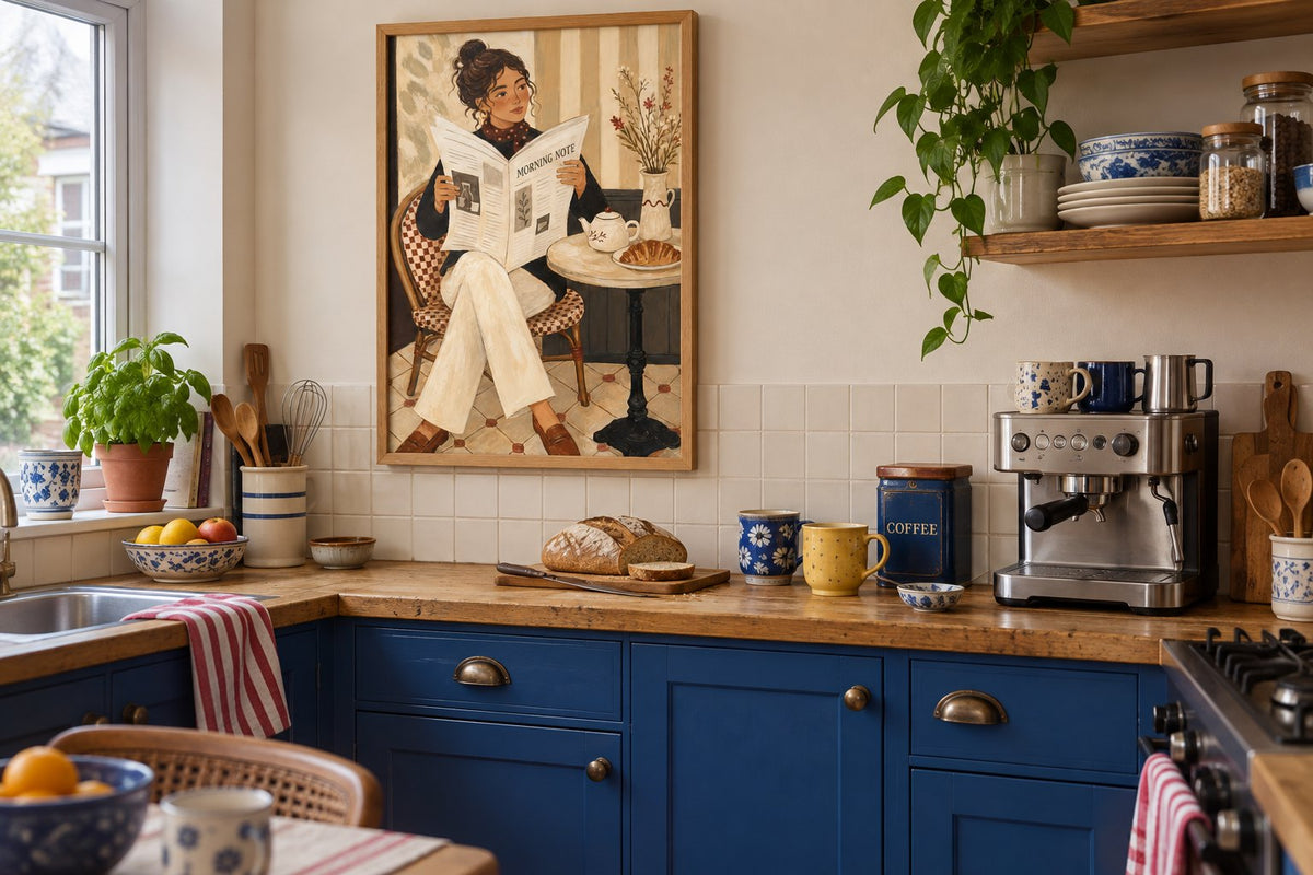
 Morning at the cafe, Morning NoteView the print
 Cafezinho in the sun on tilesView the print
 Coffee Seen From AboveView the print
 Moka Pot and Red Cup on a Blue TableView the print
Choose colours with the existing kitchen
With a wooden worktop and light cabinet fronts, beige prints create warm continuity. Green prints respond to a plant or cup, while blue prints stand out more. Echoing a single colour in one accessory is enough; there is no need to replace all your tableware.
If the tiles already carry a strong pattern, look for an image with a relatively simple background. A black-and-white composition can add a clear line to a colourful kitchen. For a warm palette, our guide to pairing colours with terracotta helps you choose between cream, green and blue around the elements you want to keep.
Keep a clear surface for making coffee
Group small accessories on a tray if it genuinely simplifies your routine. Store reserves elsewhere and keep only what you use daily within reach. Before adding a shelf, check that you can still fill and clean the appliance. A pretty area that is difficult to use often spreads back across the rest of the worktop.
A print decorates without adding another object to the surface. Nevertheless, keep paper away from steam, splashes and heat. A frame does not make a print waterproof. Place it on a side wall or in a drier area if the wall directly behind the machine regularly receives moisture. Follow your appliance’s installation instructions.
Find the right place for the frame
On a small wall, compare 21 × 30 and 30 × 40 cm paper sizes before considering anything larger. Cut a template matching the frame’s outside dimensions and check the space with the coffee maker, cupboard doors and usual objects in place. A portrait uses height; horizontal prints need a wider surface or wall section.
Oak can continue the worktop, while black can echo an appliance detail or handles. In an open kitchen, look at the frame from the table: our dining room wall art guide helps connect both areas. You can also pick up a tone in Mediterranean prints if that mood already runs through the room.
Finish with the things you enjoy using
Put your favourite cup, a useful tea towel and the coffee back in place, then observe the nook during an ordinary morning. If you have to move everything to make a drink, simplify before adding decoration. If the surface remains practical, the image can become the detail you enjoy whenever you enter the kitchen.
Affichely paper prints are made to order in Fayence on 270 gsm semi-matte photographic paper with pigment inks. Choose the subject for the atmosphere, the size for the wall and the frame for the materials already present. Your coffee nook can stay small while giving a pleasant place to this moment in the day.
Make room for your coffee break
Café scenes, cups and illustrations for your favourite little corner
Explore coffee printsA print for your coffee nook.
Explore coffee prints

