

Minimalist decor: how do you give a single print its place?

You want to keep a wall simple without leaving it empty. Start with a print you love, a clearly recognisable subject and enough room around it. A strong colour can work perfectly well, even in a very restrained interior.
The difficulty often lies around the image: the lamp, books and cabinet also belong to the composition. Here is how to choose a single print and test what happens when you remove one small group of objects.
Look for a clear motif rather than a pale image
Minimalist decor can include vivid blue, a large word or a photograph. What matters here is hierarchy: one main subject and few elements asking for equal attention. Among our minimalist prints, examine unpatterned areas, subject placement and contrast. A strong background is not necessarily a busy one.
Our blue prints offer a useful example: a broad expanse of water lets a small figure exist without accumulating details. Our photographic prints also let you search for a shadow, a horizon or an isolated object. First choose what you want to look at, then check that the composition keeps that idea legible at the actual viewing distance.
Separate space inside the image from space on the wall
The empty space within a print belongs to its design. The space outside the frame belongs to your room. An open image can still feel cramped if its edge almost touches a shelf or curtain. Our sea prints often illustrate this difference: an open horizon still needs visible room around the frame.
Place a paper template matching the outer frame size where you intend to hang it, then step back. Include switches, furniture corners and the lamp in your view. The aim is not a universal measurement, but seeing the entire frame without obstacles. Our guide to choosing art for a small living room explores the wall’s actual limits.
Four prints with different degrees of presence
The swimmer out at sea shows a tiny swimmer in a wide expanse of blue water viewed from above. It has intense colour and very few subjects. Alone under the crescent places a small figure on ochre terrain beneath a huge pale crescent. The difference in scale between person and sky is its main idea; our moon prints extend this exploration.
Soft Hours, burgundy type arranges large burgundy letters against a light background. The word becomes a shape, with a denser graphic presence than the swimmer. Compare our typographic prints if this relationship with text appeals to you. School of Fish in the Blue shows a small shoal in a wide turquoise expanse. Our fish prints offer other balances between movement and uncluttered space.
 The swimmer out at seaView the print
 Alone under the crescentView the print
 Soft Hours, burgundy typeView the print
 School of Fish in the BlueView the print
Try removing one group of objects
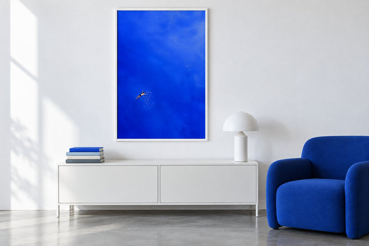
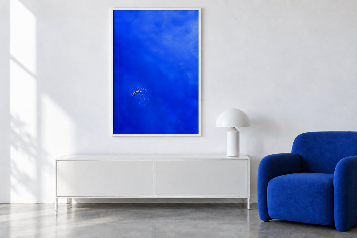
In our simulations the white wall, white cabinet, blue armchair and print The swimmer out at sea remain identical. The lamp stays in place too. The first image has a stack of books on the cabinet’s left side; in the second, that stack disappears. Neither frame size nor room colour changes.
With the books, the cabinet contributes more to the composition. Without them, the eye reaches the print and lamp more directly. Either version may suit your habits: a book you are reading need not disappear for the sake of a style. Try this with just one group of objects and keep the things you genuinely use.
Keep the colour and simplify the connections
The armchair’s blue echoes the water, while the white frame relates to the wall and cabinet. This repetition connects the elements without removing colour. Our line drawings reduce the number of lines instead; our abstract prints allow a choice of a few large shapes. These are different responses to different preferences.
A light print on a white wall is not automatically discreet: a black edge or a very large word can draw considerable attention. Compare our white prints by their actual contrast. If you are more interested in the relationship between natural materials and restraint, our article on prints for Japandi decor considers that different approach.
Hang according to furniture and viewpoint
A single print does not have to occupy the geometric centre of the entire wall. It can relate to a chest of drawers or an armchair, especially in an open room. Our living room prints are also viewed while seated: check that objects on the cabinet do not hide the drawing.
In a bedroom, choose an area you enjoy seeing from the bed or doorway. Our bedroom prints can occupy a side wall without requiring an arrangement above the pillows. Check the format on the product page, then the frame’s outer size. Our frames and hanging accessories help complete the presentation for your wall material.
Choose something that belongs in your everyday life
A restrained selection can still be personal: a memory of swimming, a figure, a word or a familiar colour gives you a reason to keep the image. Affichely paper prints are printed to order in our Fayence workshop on 270 g semi-matte photo paper with pigment inks.
Before adding a second print, let the first accompany your room for a few days. Look at it at different times, with your everyday objects and evening lighting. You will then know whether the wall needs another image or simply a little more space around the one you have chosen.
One print that really matters
From an isolated motif to bold colour, choose your presence on the wall
Explore minimalist printsMake room for the image you love.
Explore minimalist prints

