

How can you create country chic decor with wall art?

An old sideboard, a table marked by shared meals, a terracotta tiled floor: the charm is often already there. Country chic decor can start with these elements and a picture chosen for its light or subject, without adding a collection of rustic objects.
Village and garden scenes offer two different directions. Here is how to connect them to your room’s materials and colours, with four prints and a comparison where only the wall colour changes.
Keep the materials that give the room character
First notice what deserves to remain visible: the grain of a table, a painted sideboard, an uneven wall or the colour of the tiles. The picture accompanies these materials. A busy image can work above simple furniture; beside a generous crockery display, a more open scene makes each object easier to distinguish.
Country chic does not require all-white rooms or artificially aged furniture. Village prints evoke houses, paths and courtyards. Landscapes give more room to sky or hills. Choose an image that reflects how you live: a familiar place, favourite light or a garden you enjoy looking at.
Choose between a village and a garden scene
A village brings lines to the wall: facades, openings and paths structure the image. Provence prints and Brittany prints show different architecture and light. The region does not need to match your home’s address; it can recall family ties or a walk.
A garden introduces freer shapes. Garden prints suit a room looking outdoors; botanical prints draw attention closer to a leaf or branch. If the furniture already has plenty of pattern, consider the distribution of colour as well as the subject. A single flower and a dense flowerbed have very different presences.
Connect the picture’s colours to old furniture
A blue sideboard does not prevent a country atmosphere. The blue of an iris or shutter can echo it, while green recalls pottery or trees outside. Compare blue prints and green prints with the furniture in view. A partial colour echo is enough; the objects do not all need to match.
Against orange terracotta tiles, fresh greens create a visible difference. With brown wooden flooring, a light image stands out more. Keep textiles fairly simple if the print contains many details. Plain linen, widely spaced stripes and everyday crockery can coexist without recreating a holiday cottage.
Compare the irises against white and pink walls
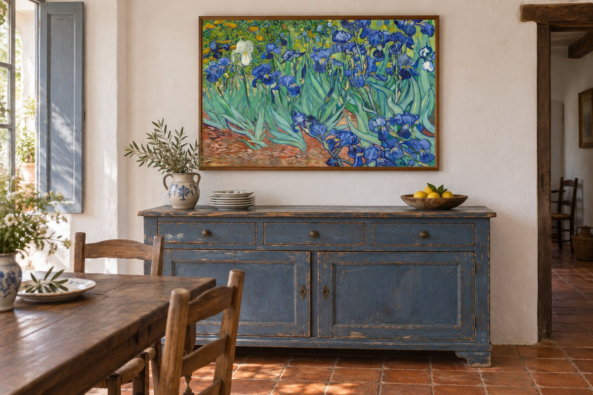
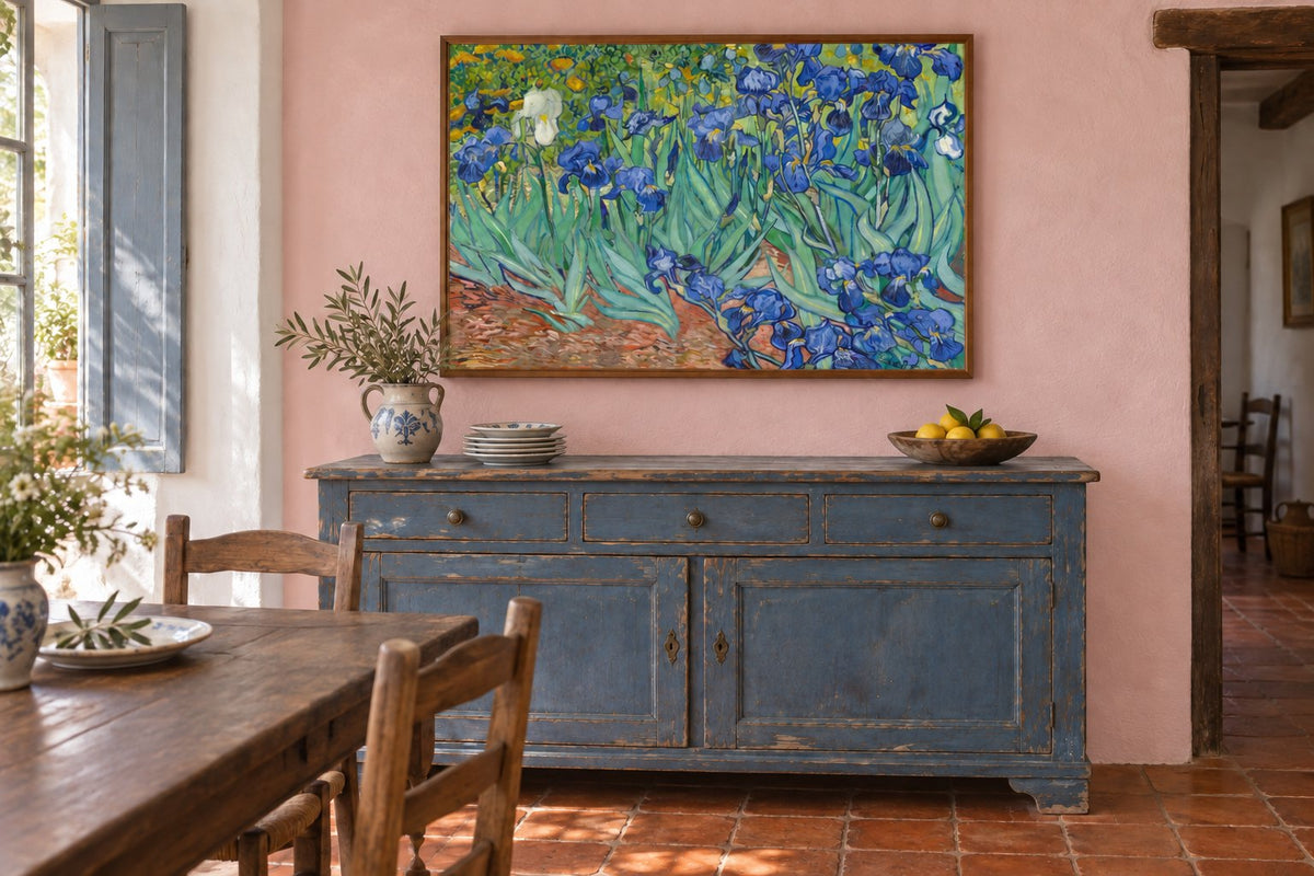
Our mockups show the same weathered blue sideboard, terracotta floor and Irises in landscape orientation. The whole composition remains intact: blue flowers, green leaves and the white iris are preserved. Only the wall changes from white to pale pink. Furniture, brown frame, plates and lighting stay in place.
On white, the greens and blues stand out clearly. Pink creates another relationship with the warm floor tones. This comparison helps you decide whether the picture is enough or whether you prefer colour around it. Classic art reproductions and flower prints provide other compositions to consider with the same furniture.
Four pictures for different kinds of countryside
Provence - The shaded courtyard with baskets of figs shows a Provençal courtyard in sepia tones, a large tree, an arch and baskets, with the word Provence. It suits an interest in stone textures and photographs with an old-fashioned appearance. Brittany - The boat waits for the tide depicts Breton houses, a boat at low tide and tall trees. Its blues can easily connect with painted furniture.
The Orange Trees shows a shaded garden terrace, figures and lightweight furniture. Patches of light matter as much as the foliage. Irises brings the eye closer to a bed of irises, with strong leaf shapes. Each of these four directions can stand alone. For a dining room, our guide to pictures beside the table or sideboard helps choose a position before adding more frames.
 Provence - The shaded courtyard with baskets of figsView the print
 Brittany - The boat waits for the tideView the print
 The Orange TreesView the print
 IrisesView the print
Hang the picture where the house is used
In a kitchen, choose a wall away from splashes, steam and heat. A paper print does not belong immediately above a cooking area. Kitchen prints are also viewed from the eating area, alongside the chairs and table you actually use, rather than accessories arranged only for a photograph.
In the living room, leave some clear wall between the picture and objects on the sideboard. Living room prints can connect the dining area to a bookcase without repeating precisely the same subject. To add plants, see our guide to combining botanical prints and plants: leaves should not hide the drawing.
Finish the hanging without erasing differences
Check the available size on the product page, then the frame’s outside dimensions. Frames and hanging accessories help you choose a finish suited to the wall. Brown wood can echo the table; a simpler outline can let the picture speak. Every frame does not need to repeat the sideboard’s worn finish.
Affichely paper prints are made to order in our Fayence workshop on 270 g semi-matte photographic paper with pigment inks. Choose one image first, then live with it. Country chic decor keeps useful crockery, familiar furniture and traces of the home’s life. The picture adds a personal perspective without turning the room into a frozen set.
Your own view of the countryside
Villages, courtyards and landscapes to bring home
Explore village printsChoose a place that connects with your furniture and memories.
Explore village prints

