

How many frames should you choose for a gallery wall?

A gallery wall can lack cohesion when the pictures are too far apart or the alignments are difficult to read. Gaps, sizes and colours offer several ways to balance it.
Here are five arrangements to compare, with height guidelines and calculations to help you try them at the scale of your own wall.
Guidelines for a coherent arrangement
Spacing: start with 5 cm. This distance provides an initial reference between two frames. Keep it consistent throughout the arrangement, then judge the result from the available viewing distance. Thick mouldings or large prints may need more breathing room. Measure between the frames’ outer edges, not between the printed sheets.
Choose a shared line. In a row of different sizes, align their centres for a regular rhythm, or their lower edges if you prefer a frieze. With two rows, also watch the vertical spacing. A free arrangement works better when a repeated line or distance helps the whole group make sense.
Adapt the height to the furniture. A centre around 145 cm above the floor is a starting point on an empty wall. Above a sofa, try a gap of 20 to 25 cm between the backrest and the lower edges of the frames, then check from your seat. Backrest height, switches and the occupants’ heights may lead you to move the group.
The five arrangements
1. The pair
Two prints of the same size, side by side. This arrangement suits narrow walls: between two windows, above a console or in an entrance. It calls for two pictures that relate without repeating each other: the same subject seen in two ways, or two versions of the same landscape.
2. The trio with a central picture
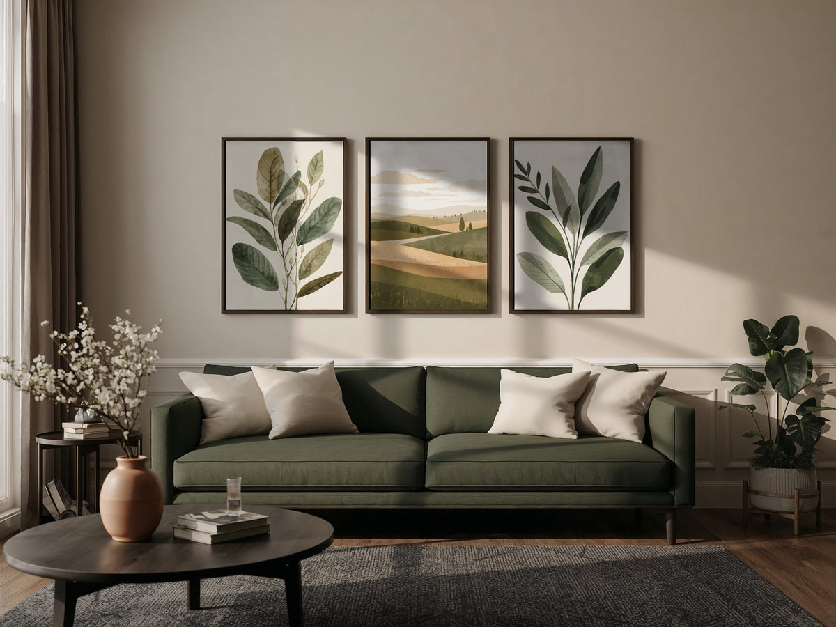
One large print in the centre, with a smaller one on each side: the central piece leads the composition while the other two accompany it. A 70x100 between two 30x40 prints creates a clear difference in scale. A 50x70 with two 30x40 prints makes a more compact group. Here, trio means three separate pictures; a triptych is an artwork conceived in three parts.
3. The grid
Four prints of the same size, arranged two by two. This is the most orderly arrangement and the easiest to get right: everything is identical except the pictures. It suits square walls, the ends of corridors and offices. One condition matters: the four pictures need a visible connection, such as a palette, line style or subject. Without it, the grid highlights the disorder instead of organising it.
4. The group of five
Five prints spread across two rows let you follow a large piece of furniture or build around a main picture. Define the group’s outer outline first, then place the two smaller pictures in the remaining space. The required width depends on the chosen sizes: the number of frames alone gives no minimum dimension.
5. The gallery
Six prints in two rows of three create a regular gallery. You can bring together different subjects while retaining a connection, such as identical frames or a colour found in every picture. Lay the six frames on the floor before drilling: a very dark image attracts more attention and may unbalance an otherwise well-aligned row.
Which print sizes fit your wall width?
To begin, try an arrangement spanning around 60 to 75% of the furniture’s width. Above a 200 cm sofa, that means 120 to 150 cm. This decorating guideline remains adjustable: a large empty wall and an already busy room call for different results. Add the frames’ external widths and the spaces between them.
- A small space: two portrait 30x40 prints separated by 5 cm occupy 65 cm before adding the mouldings. This arrangement lets you try a pair above a console.
- Above a sofa: a 70x100 between two 30x40 prints occupies 140 cm with two 5 cm gaps, excluding mouldings. Compare this total with your furniture’s actual width.
- A large section of wall: a gallery of six 50x70 prints arranged in two rows of three spans 160 cm with two 5 cm gaps, excluding mouldings. You also need to measure its height.
The four paper sizes are 21x30, 30x40, 50x70 and 70x100 cm. Their proportions are not exactly identical. Also respect each artwork’s orientation and composition: a horizontal landscape retains its framing when placed alongside a vertical portrait.
Try the arrangement before hanging it
The arrangement tool lets you compare a layout, prints, sizes and frames in the same scene. Then use your selection’s external dimensions to mark out its footprint at home. Paper sheets temporarily attached with an adhesive suited to the wall make this check practical, both from the room’s entrance and from the sofa.
Try it on your wall
Preview your gallery wall with your room’s actual colours
Arrange my gallery wallIf you would rather have just one frame
A photo collage brings several pictures together in one print behind a single protective front. It offers an answer for walls without room for a full arrangement, or for anyone who wants a single framed piece.
What you receive

Each print is made to order at our workshop in Fayence on 270 gsm semi-matt photographic paper using pigment inks. Unframed prints are sent rolled in a tube. A print ordered with its light oak, black or white frame arrives already framed. Preparation and delivery information is available in the FAQ.
Where to start
First choose pictures for the room: living room prints, bedroom decor or office pictures. To connect different subjects, look for a repeated blue, beige or brown. Botanical subjects, landscapes and black and white pictures offer three distinct directions. You can also compare minimalist compositions and the decorating selection before choosing your trio.
Try these arrangements at the scale of your wall.
Arrange my gallery wall

