

Office decoration: which wall art should you choose?

A professional office brings together different uses and different viewers. The right print depends on both the available wall and the room: a picture visible from reception needs a slightly different approach from one beside a meeting table. Start with the position, then compare subjects, colours and frames from the seats people actually use.
Abstract office prints offer a starting point when no figurative subject appeals to everyone. Architecture or a landscape can work too. The aim is to give the space a presence, with pictures the team is happy to see each day and visitors can notice easily.
Start with the way each room is used
At reception, look at the wall from the entrance and from the waiting seats. A print with clearly defined shapes can remain visible behind a counter, whereas a detailed scene needs closer viewing. Keep directions separate from decoration: visitors should find their destination without searching through several framed messages.
In a meeting room, account for the whiteboard, screen and storage before assigning space to a picture. Beside desks, check what seated colleagues will see. The office print collection helps you compare these uses; our home office guide focuses more on a personal workspace.
Choose a subject people can share
Make a short selection before asking the team. Three distinct directions make discussion easier: a minimalist composition, geometric shapes or a figurative picture. Ask what people notice and which proposal fits the room. This makes the discussion about a visible, specific choice, without suggesting colours automatically improve concentration.
Architectural prints can echo window lines or a metal structure. Landscapes introduce a horizon into an enclosed room, provided the occupants like the subject. A black and white selection is easier to coordinate with several furniture colours, although you still need to consider each picture’s actual contrast.
Compare two prints in the same room
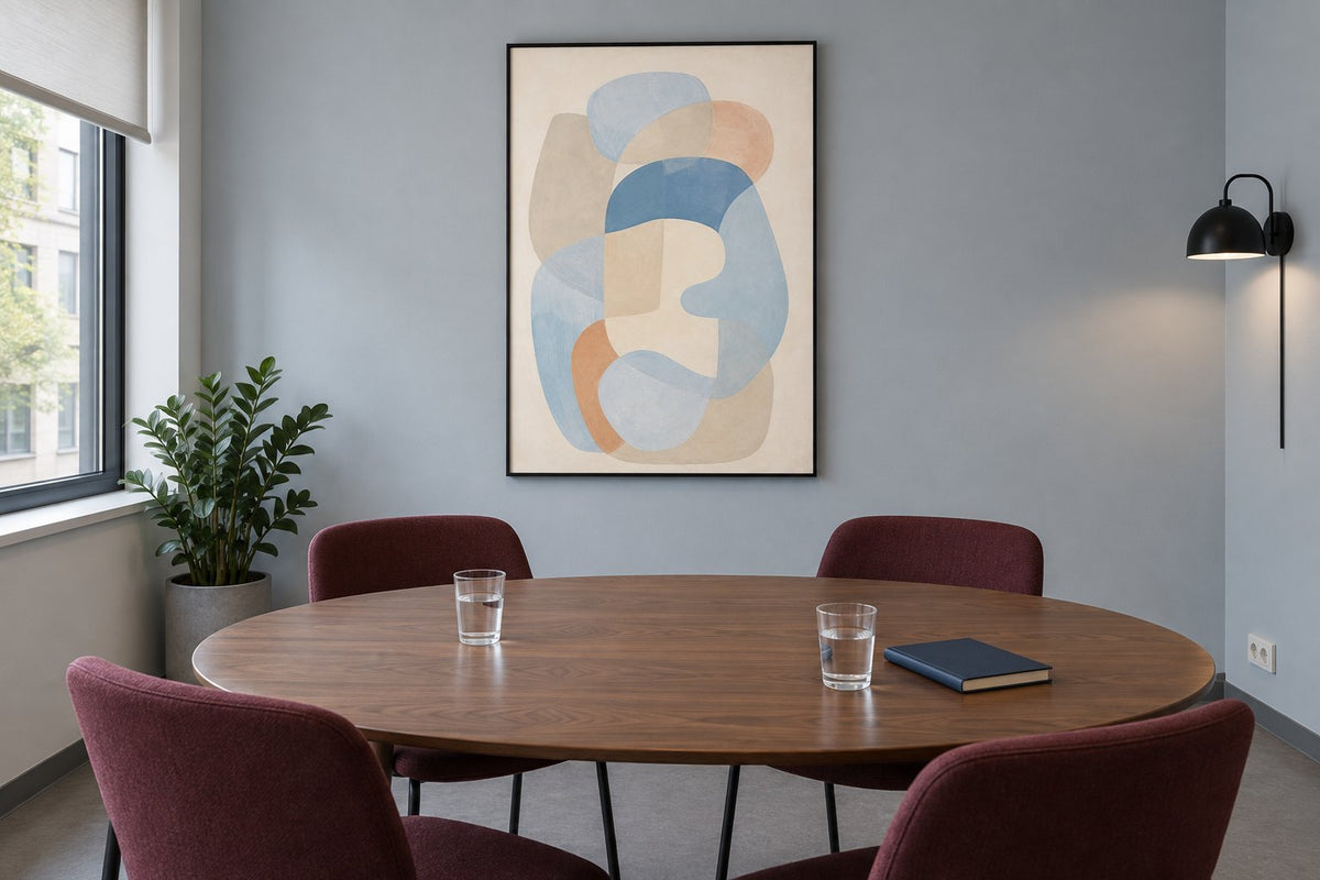
In the simulations below, the blue-grey wall, walnut table, burgundy chairs and black frame stay the same. Only the print changes. The curves in Balance of blue shapes quietly echo the wall’s blue tones. Their pale colours leave plenty of visual space for the furniture, where wood and fabric already add stronger colours.
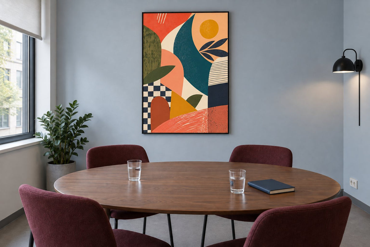
With The shapes of midday, areas of coral, mustard and deep blue draw more attention. Your choice depends on how prominent you want the picture to be in this room. Compare blue prints with orange compositions on this basis, then check your own finishes using our guide to wall colours.
Four pictures with four different presences
Balance of blue shapes layers rounded blue, grey and peach shapes on a pale background. It suits a gentle transition between picture and wall. The shapes of midday instead combines broad colour blocks, a checkerboard and striped motifs. Its graphic details work with simple furniture, without requiring you to repeat every colour in the room.
The black gesture on amber shows broad black brushstrokes across amber, ochre and rust-coloured areas. The contrast creates a clear presence from a distance; allow space around it if the wall already has several dark elements. Ice in Motion offers translucent fragments and curves in icy blues. This abstract picture has more subtle shades to examine up close, perhaps beside a waiting area.
 Balance of blue shapesView the print
 The shapes of middayView the print
 The black gesture on amberView the print
 Ice in MotionView the print
Check the furniture and the real lighting
Measure the usable wall, excluding openings, switches and tall furniture. Mark the proposed frame outline with a paper template. Look from the entrance, then from the chairs: this often reveals a picture that is too close to a shelf or poorly aligned with its accompanying furniture. The middle of the wall is not always the best reference.
Watch the light at different times of day too. A window opposite the frame may create an awkward reflection, depending on the finish and your position. Compare frames and hanging options before ordering, then read the chosen product’s details. A simulation helps you judge the composition but cannot reproduce your premises’ exact lighting.
Connect several spaces without repeating one print
For several rooms, choose a simple connection: the same frame finish, a secondary colour or a family of subjects. Reception might feature a graphic composition, while a corridor displays more detailed pictures. Keeping one common thread allows different atmospheres without making every room a copy of the last.
Typographic prints need particular attention to the wording and language in a shared setting. Choose a message suited to the people using the office. To coordinate several pieces, prepare your selection from the professional catalogue, noting the room, wall, intended size and preferred finish for each one.
Make the final selection easy to check
Before approval, compare the pictures with recent photographs of the premises. Check the sizes offered on each product page and whether the hanging method suits the wall. If your premises have particular requirements, confirm the necessary specifications before purchase; a decorative print does not replace mandatory signage.
Affichely prints are made to order in Fayence, on 270 gsm semi-matte photographic paper with pigment inks. Keep your list of references and positions: it will help when ordering, hanging the frames and adding compatible pieces later.
Wall art for your workspace
Compare abstract compositions to suit your office colours and furniture.
Explore office printsYour office art selection
Explore office prints

