

How can you give your home a holiday feel?

A lunch that lingers, an open door, light falling across a table: summer changes how you use a room. Your decor can follow that rhythm without looking like a holiday rental or hiding away your favourite furniture.
A bright image and a few lighter textures can already give the dining nook or living room a different feel. Here is how to choose those changes, with four prints and a comparison showing the effect of a single textile.
Start with a memory rather than a whole new setting
What detail reminds you of a holiday: blue shutters, a piece of fruit on a table, a crisp shadow on a staircase? That memory helps you choose a personal image. Among our summer prints, look for a subject you will enjoy on an ordinary morning. The season can come through in the light within the image, even without a beach or palm tree.
Keep the dark piece of inherited furniture, the red chair or the objects brought back from your travels. They give your new wall art a story that has already begun. Mediterranean prints suit you if those buildings and colours speak to you; landscapes open up other horizons. Our guide to decorating walls with travel prints helps connect a destination with your interior.
Choose a colour that is already in the room
A blue kitchen does not have to turn white to welcome summer. Yellow in a print can work with the cabinets; a red detail can connect with a mismatched chair. Compare yellow prints, blue prints and red prints, taking note of what your furniture already brings to the space. Sometimes the best connection takes up only a small area.
If the room contains several bold colours, leave some calm space around the frame. An image with a largely open background may be enough. Minimalist prints suit this approach; orange prints can add a sunnier accent near green or blue furniture. Avoid adding lots of matching accessories before you have looked at the print on its own wall.
See what a single textile changes around the print
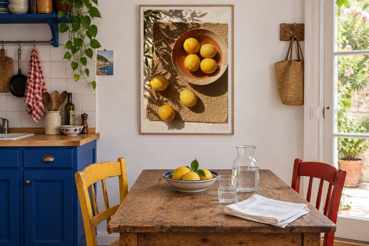
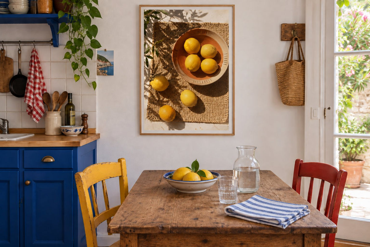
Our two visualisations show the same kitchen: cobalt blue cabinets, an old table, a yellow chair, a red chair and a white wall. The Lemons in a bowl under the shadows print stays in the same place, along with the carafe and fruit bowl. Only the folded cloth on the table changes: white in the first image, blue and white striped in the second. The link with the cabinets becomes stronger without adding another object.
The comparison helps you decide how much repetition you like. Would you rather let the picture catch the eye? Keep the plain cloth. Do you prefer a dining nook with a more patterned feel? Try a stripe already present in your crockery or textiles. Among our kitchen prints, consider how the image works with your actual table, not just the worktop.
Four prints, four ways to evoke summer
Lemons in a bowl under the shadows shows photographed lemons in a bowl and on a woven surface, with strong shadows. The subject works particularly well in a dining nook. Provence - The lemon tree by the door depicts a blue door, steps and a striped awning in Mediterranean architecture. This scene adds a different kind of depth, useful if you are looking for a view beyond the room rather than a still life.
Lemons in the sun features large yellow lemons and green leaves beneath a graphic sun. Ibiza - The island in apricot combines a geometric house, a palm tree and mauve shadows against an orange background. Both illustrations give flat areas of colour a stronger role. Compare our decorative illustrations with our seaside prints if your summer memory is closer to the water. Choose a direction before arranging several frames.
 Lemons in a bowl under the shadowsView the print
 Provence - The lemon tree by the doorView the print
 Lemons in the sunView the print
 Ibiza - The island in apricotView the print
Lighten the living room without losing its personality
Put away the throw you no longer use and clear part of the coffee table. Keep your books and the lamp you use in the evening. A print can then take its place above the sofa or a low cabinet. Choose living room prints from the position where you actually enjoy the room, with enough distance to take in the image.
Wood, painted metal and ceramics can all work together in summer decor. A dark sofa does not rule out a lighter feel: try an image with a pale background and a brighter cushion. Terracotta prints complement warm woods; green prints can connect with a plant. For a coastal setting, see our guide to seaside living room decor.
Keep the room comfortable to move through and use
In a small room, start with the available wall rather than the print size you have in mind. Check opening windows, chair backs and the space around the table. Near the kitchen, choose a position away from splashes and steam. A frame does not turn a paper print into an object designed for outdoor use.
In the bedroom, a holiday image can sit near a chest of drawers without filling the whole wall above the bed. Bedroom prints also include understated compositions that are pleasant all year round. Check the size offered on the product page, then the frame's external dimensions. Frames and hanging accessories let you complete the print according to your chosen material.
Choose an image that will stay after the holidays
The useful question is simple: will you still enjoy this print when the throw returns to the sofa? A kind of light, a place or a colour you love can easily outlast a season. Affichely paper prints are printed to order in our Fayence workshop, on 270 gsm semi-matte photo paper with pigment inks.
Start with a single area and let the room settle around the new image for a few days. The cloth, a bowl or a cushion can change later. A summer interior keeps its familiar habits, useful objects and distinctive colours; it simply gives them a little more space in the light.
Find the image that reminds you of brighter days.
Explore summer prints

