

New York on the wall: which view should you choose for your living room?

You love New York but are torn between a detailed avenue, a skyscraper silhouette and a view of Brooklyn Bridge. The images share the same city's name, yet they give the wall different directions. Composition deserves as much attention as colour.
First notice whether your eye follows a street, a horizon or a map. Here is how to compare these views, then choose their position, format and frame alongside your living room furniture.
An avenue to follow into the distance
In a street-level view, façades converge towards a distant point. Cars, steam and pedestrians give the eye several stopping places. New York prints let you compare this depth with flatter compositions. A detailed avenue suits a position where you can also look closely as you pass.
Architectural prints help you identify the lines you like: close verticals, regular façades or an open perspective. This structure can become the main subject on your wall, particularly if surrounding objects stay simple and do not hide its vanishing point.
Skyline and bridge: consider the horizon
A skyline gathers buildings into a silhouette with water or sky around them. It reads differently from an avenue: your eye moves mainly along the rooftops. Bridge prints introduce a diagonal or a crossing in the foreground. Compare the space occupied by the bridge and sky instead of looking only for the most recognisable landmark.
Skyline does not necessarily mean a horizontal print. Some compositions retain a portrait format to show plenty of sky or reflections. Check the model's orientation, then explore landscape-format prints if your position genuinely needs a wide image. Our guide to decorating a large wall with pictures helps define the useful area around the furniture.
Four views to clarify your choice
New York - The avenue under the steam shows a photographic avenue with steam, façades and small yellow accents in the traffic. New York - Reflections on the East River combines the bridge, towers and reflections under a blue evening sky. The first leads into the street; the second divides attention between architecture, water and light. Photographic wall art offers more ways to explore these differences in texture and detail.
New York - Manhattan from the air draws Manhattan from above in a muted palette reminiscent of an illustrated map. New York - The taxis by the water simplifies towers, bridge and taxis into large coloured shapes. Decorative maps reward close viewing; illustrated prints give more space to graphic rhythm. A decorative view is not a navigation map: choose it for its composition.
 New York - The avenue under the steamView the print
 New York - Reflections on the East RiverView the print
 New York - Manhattan from the airView the print
 New York - The taxis by the waterView the print
Black and white or colour: inspect the whole image
An almost grey print may still contain yellow taxis or blue in the sky. It is therefore not necessarily black and white. Check the product page and enlarged image before matching it to your room. Black and white prints organise the subject through tonal values; blue prints can introduce an evening atmosphere into an already colourful room.
A yellow accent can echo a lamp or cushion without repeating that shade everywhere. Compare yellow prints to see how much of the image this colour actually occupies. Our guide to matching a black and white print to your wall explains another approach if you prefer contrast to a new dominant colour.
Compare frames in a contemporary interior
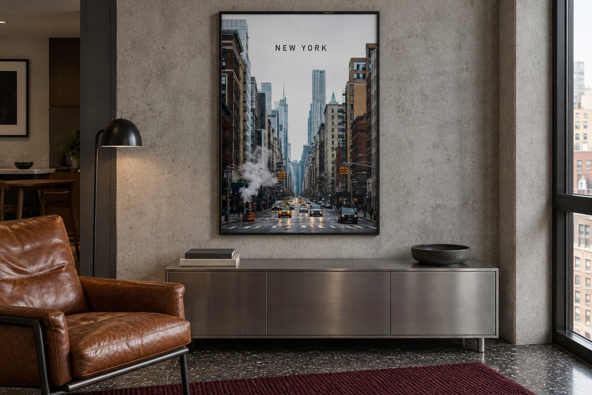
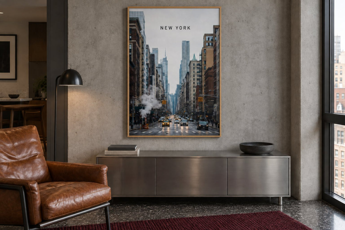
Our simulations keep the same avenue, concrete wall, metal cabinet and leather armchair. The black frame connects with the dark lines of the window and lamp. In the second image, only the frame becomes light oak: a warmer outline appears around the scene without changing the image.
The choice depends on the materials already in your home. Leather can work with either finish, as can metal. Consider frames and accessories with the whole room, then test a template matching the chosen outside dimensions. Keep the format identical during this comparison: enlarging the print too would prevent you from isolating what the finish adds to the wall.
Put detail at the right viewing distance
A dense map loses some of its interest if it stays beyond comfortable viewing behind a deep sofa. A graphic silhouette may remain clear from farther away. In living room wall art, compare the scale of the details you enjoy, then mark out the frame's overall size on the wall. Check that those details remain visible.
Leave enough space around a strongly structured image. A full bookcase and a busy avenue can compete; moving a few objects sometimes clarifies the arrangement. The trial checks the relationship between the scene, the furniture and your everyday viewpoint.
Check the light before making your final choice
Look at the wall with your evening lamps switched on. A central reflection may conceal the very bridge or street that made you choose the image. Change your viewing position and check the window's location before fixing the frame. Dark photographic areas also need enough light to remain distinct without an intrusive bright beam.
Affichely paper prints are made to order in Fayence on 270 gsm semi-matte photo paper with pigment inks. Choose a view for its complete structure: a street to follow, a silhouette to recognise or details to discover. The city can then have a precise place in your living room alongside the objects and habits that already belong there.
Choose your view of New York
Avenues, bridges and silhouettes for a personal wall
Explore New York printsFind the New York composition that suits your living room.
Explore New York prints

