

How do you arrange picture frames on a staircase?

The staircase wall seems ideal for pictures, but its slope complicates the first attempt. An image looks well positioned from below and too high when you reach the landing.
Start by separating the places you pass through from those where you can stop. Choosing the images and arranging them then becomes much simpler.
Distinguish the stair wall from the landing wall
A wall beside a flight of stairs accompanies movement. A landing wall is viewed more like a room wall, from a level floor. These two situations need different arrangements. On the slope, a sequence can follow the ascent; on the landing, one main artwork may be enough. Black and white prints provide an easy thread to maintain between levels.
Identify doors, light switches and the handrail too. These are the practical limits of your composition. An image must not obstruct your grip on the rail or protrude into a narrow passage. Hallway wall art gives ideas for surfaces close to circulation routes, while the landing can accommodate a more detailed scene.
Choose a family of images that works as a sequence
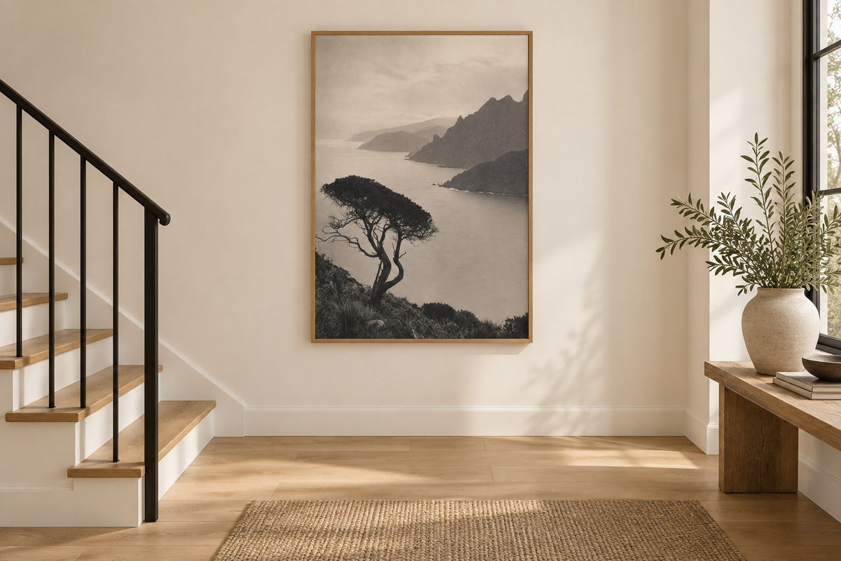
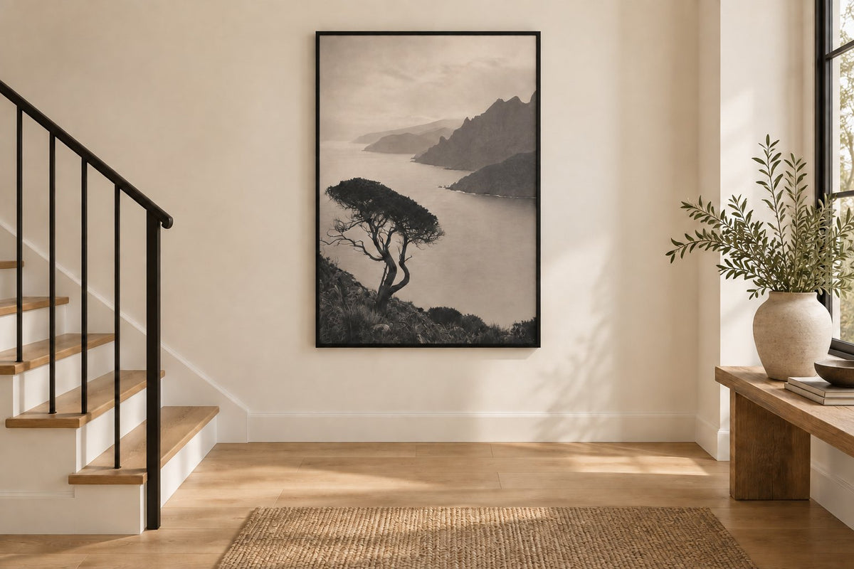
The pine leaning over the gulf presents a tree and a coast in a soft palette. Japan - Misty Mount Fuji brings a misty Japanese landscape. Skipping rope to a jazz beat tells a street scene around games and music. The child on the wet cobbles follows a child on wet cobblestones. You can bring different subjects together if their treatment, contrasts or frames retain a visible coherence.
Landscapes let you build a walk from one image to the next. Japan prints give a more specific direction, while city scenes suit a narrative series. Avoid choosing each frame in isolation: place the images side by side to judge their relationship before thinking about the height of the stairs.
 The pine leaning over the gulfView the print
 Japan - Misty Mount FujiView the print
 Skipping rope to a jazz beatView the print
 The child on the wet cobblesView the print
Compare two frame finishes on the landing
Our two room visualisations show the same print on a landing wall in the same staircase. The oak frame echoes the wooden stairs and creates continuity of material. The black frame emphasises the drawing more. Its outline remains more prominent from below without changing the format or moving the image on the wall.
This comparison mainly helps you decide the role you want the frame to play. If the handrail is black, a dark outline can echo it. With plenty of exposed wood, an oak finish can remain more discreet. Beige prints encourage a gentle transition; abstract compositions let you continue the architecture's lines through freer shapes.
Plan the rhythm along the ascent
For several frames along the stairs, look for an even progression. You can follow the slope with the images' centres or arrange distinct small groups. The key is to see an intention from both ends. A layout planned only from below can become confusing halfway up, where differences in height become more noticeable.
Prepare templates matching the frames' outer dimensions, then have their positions checked from accessible levels. Keep visually similar gaps without forcing a frame in front of a switch. Portrait-format prints use moderate width; landscape formats need a clearer section and often work better on the landing.
Adapt formats to the actual viewing distance
An image seen from the other end of the staircase needs a readable subject. A photograph filled with small details deserves an area where you can stop instead. For paper prints, compare 21 × 30, 30 × 40, 50 × 70 and 70 × 100 cm formats according to the available wall, then add the space occupied by your chosen frame.
Do not decide the format simply because the wall is very tall. The surface above the steps may be large yet difficult to see or reach. A well-positioned artwork on the landing sometimes has more presence than a sequence scattered high up. Minimalist prints are an option when the viewing distance favours simple lines and clear contrasts.
Keep a connection with the entrance and upper floor
The staircase connects several atmospheres. One shared finish can be enough to accompany them, even if subjects change from one level to another. Botanical motifs can pick up plants in the entrance; a mountain print can echo a nature-inspired bedroom. You do not need to reproduce the same palette in every room.
Our guide to decorating an entryway wall with a console helps you compose the start of the staircase. If the landing opens onto a large empty surface, the advice on decorating a large wall with artwork explains how to define a coherent area. Look at these spaces together before adding frames between every door.
Plan an accessible, stable installation
Check reflections under the lights used in the evening and maintain access to switches. The fixing must suit the wall material and frame weight. For an out-of-reach area above a flight of stairs, use someone equipped to work on a staircase. A decorating trial is not a reason to improvise an unstable support on the steps.
Affichely paper prints are made to order in Fayence on 270 gsm semi-matte photo paper with pigment inks. Choose the image family and main location first, then the formats. A successful arrangement accompanies movement between floors and remains pleasant to view from the places you actually occupy every day.
Compose your staircase wall
Images to bring together through subjects, contrasts or frames
Discover black and white printsA rhythm of images between floors.
Discover black and white prints

