

Japandi: which prints should you choose?

You enjoy simple lines, wood and compositions that leave space around objects. A print can accompany this Japandi sensibility, whether your interior is light, colourful or furnished with pieces from several periods.
Your choice need not be limited to a beige picture. Look at the subject, its drawing and its background, then how the frame connects it with the materials already in your home.
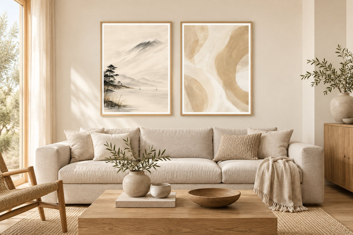
Choose between line, wash and texture
The Japandi selection brings together several visual directions. A black line, a mountain in mist and a printed texture create different effects. First identify what attracts you in each picture: the drawing's movement, its colours or the amount of background visible around the subject.
Line art gives the drawn line a central role. Japanese-inspired prints include landscapes and ink compositions. Beige prints explore sand and linen tones. Minimalism and abstract art let you compare freer forms, sometimes with strong contrasts.
A botanical picture can also belong here, whether it shows an isolated branch or a detailed drawing. Look at its density alongside nearby objects. Black and white offers another balance: a few fine lines remain subtle, while a large dark shape can become the wall's focal point.
Compare the frame's role in the room
The next two visualisations keep the same trio and interior. Only the frame finish changes. This comparison lets you study the outline without combining several decisions: the subjects, arrangement and proportions of the pictures stay the same.
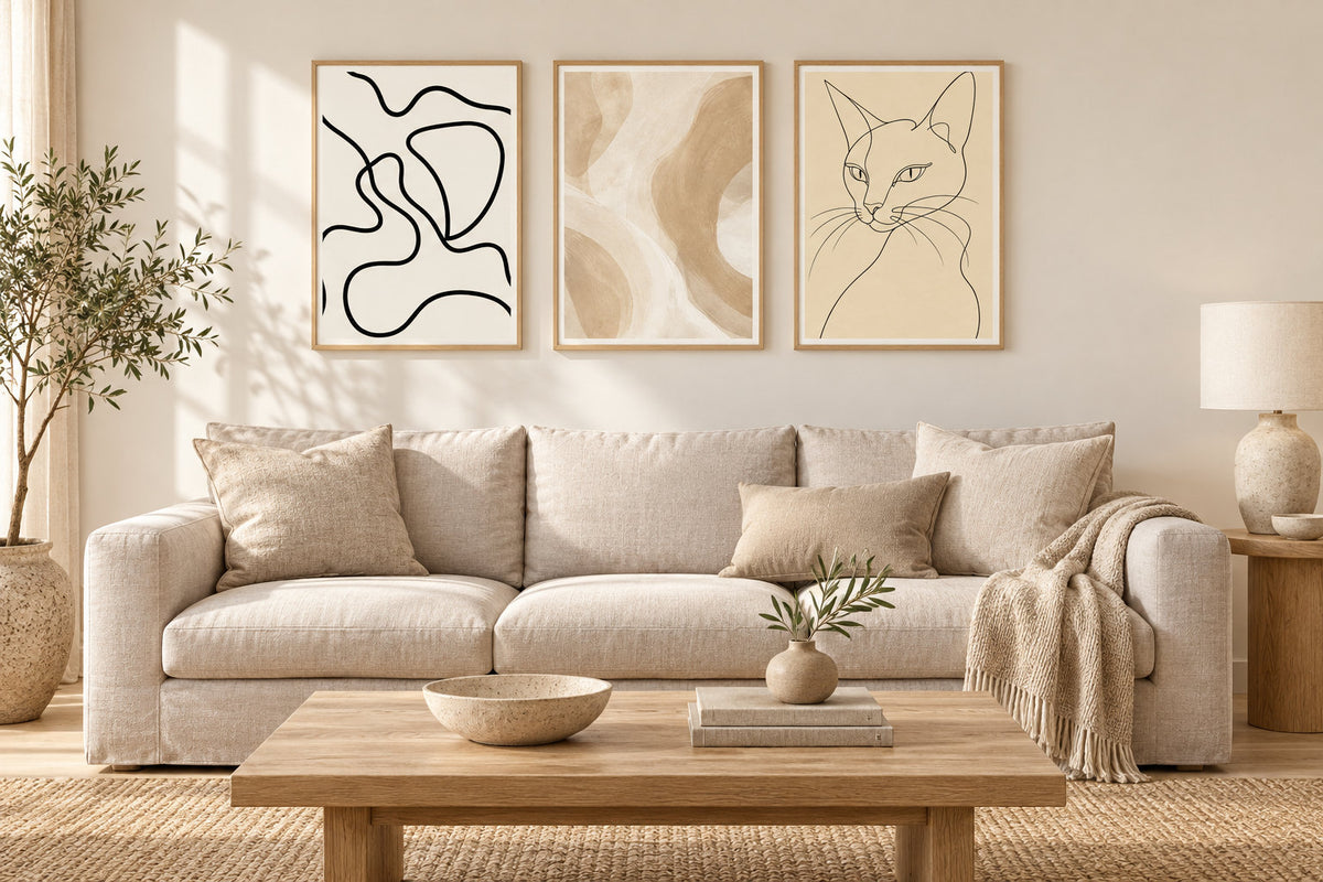
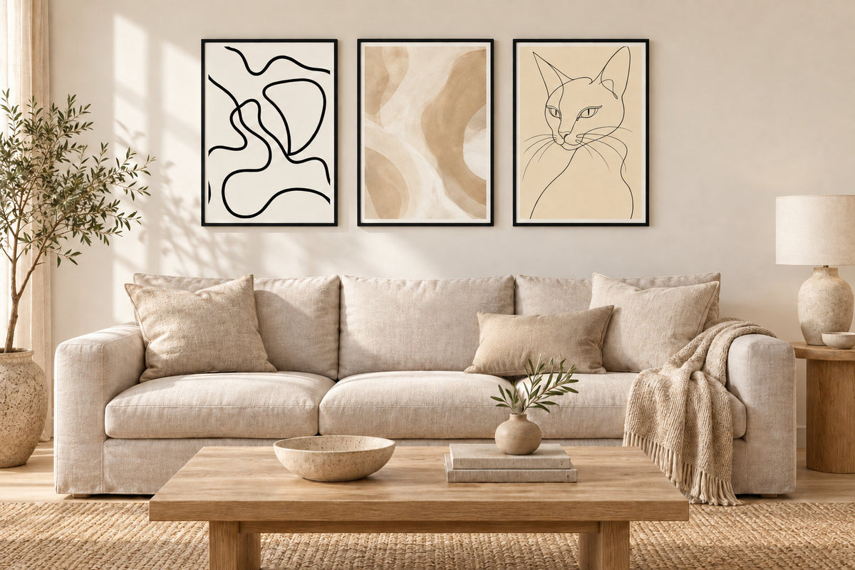
A black frame can echo a lamp or furniture legs. An oak frame can continue the wood already present, even if the shades do not match perfectly. Neither is compulsory: compare the arrangement from the entrance and then from your seat, with everyday objects in place.
Before choosing a frame, check the print size and the external dimensions of the chosen model. Moulding adds width to the composition. Our guide to framing a 30x40 print helps distinguish the stated size from the space the frame actually occupies.
Relate the picture's background to the wall
A cream background against a crisp white wall creates a visible difference in tone. You may enjoy that contrast; it does not mean the print has yellowed. Against a greige wall, the same background feels closer to the room. On dark paint, it becomes a more pronounced area of light.
Compare combinations in the wall planner, then confirm the paint using a real sample. A screen does not reproduce your lighting. The guide wall colours: which print should you choose? explains these relationships. Include your curtains and rug in the comparison too: they often occupy more space than small accessories.
Give the spaces between pictures a role
The visible wall around the frames contributes to the composition. Start with one picture or a pair, then consider whether an addition truly brings something to it. For several frames, try different gaps using templates. A 5 cm gap can create a compact group; more space gives a different sense of openness, depending on the wall.
Add up the external widths and gaps before drilling. Three portrait 30x40 prints with two 5 cm gaps occupy 100 cm before the mouldings. The guides to sizes above a sofa and gallery walls help compare a single picture with several arrangements in relation to the furniture below.
Look at the paper and reflections
Linen, ceramics, wood and a printed surface reflect light differently. You can combine these materials without requiring everything to be matt. Above all, check whether a window or lamp reflects in the frame from your usual seat: that reflection may hide part of the drawing.
Our paper prints are made to order in our Fayence workshop, on 270 gsm semi-matt photographic paper with pigment inks. This finish contributes to the result, but does not eliminate reflections from a frame's protective cover. The guide to art paper and photographic paper explains the points to compare.
Four prints focused on line
 Silhouette in a Continuous Line
View the print
Silhouette in a Continuous Line
View the print
 The sleeping dog
View the print
The sleeping dog
View the print
 Wild line
View the print
Wild line
View the print
 The charcoal loop
View the print
The charcoal loop
View the print
Four prints focused on texture
 The light on the linen curtain
View the print
The light on the linen curtain
View the print
 The plaster wall
View the print
The plaster wall
View the print
 The hanging cloths
View the print
The hanging cloths
View the print
 The river inside the pebble
View the print
The river inside the pebble
View the print
Start with one picture and a specific position
Choose a spot you look at often in the living room or bedroom. A print can echo the wood of a piece of furniture, a plant's green or the grey of a textile. Your decor remains personal when you keep objects you enjoy, without trying to reproduce an entire inspiration room.
Compare the paper sizes 21x30, 30x40, 50x70 and 70x100 using a template that includes the frame moulding. Check the design's orientation, then choose the finish alongside the furniture. You can start with one picture and add more after seeing how it feels in your own light.
Japandi prints
Lines, shapes and textures to compare with your colours and materials
Explore Japandi printsJapandi prints to complement your interior.
Explore Japandi prints

