

What goes well with a Japanese art print?

A Japanese art print can suit a contemporary living room, a colourful bedroom or antique furniture. Your choice depends as much on its lines and colours as on the objects already in your home.
Here are some ways to choose a wall, compare frames and put a group together. The room visualisations feature a contemporary Japan-inspired poster; it should not be confused with an original antique print.
Start by looking at the composition
In a work by Hiroshige or Koson, a landscape, a bird and the spaces around the subject can suggest very different combinations. Look at your particular image: which colour dominates, where is the subject, and which lines draw your eye? These details offer better guidance than rules applied to all Japanese art.
A simple scene can hold its own beside a bookcase. A dense composition may benefit from being displayed alone. Try viewing the image from the doorway and then from your usual seat: small details and the overall effect are appreciated from different distances.
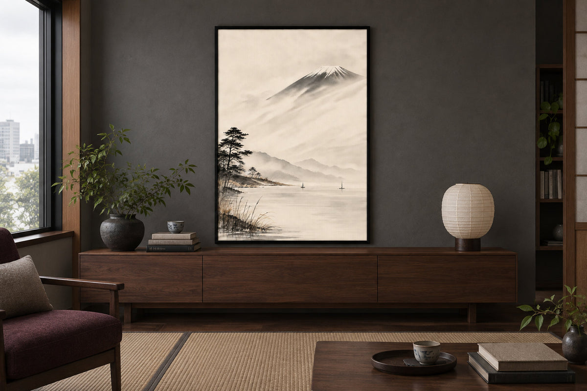
Choose the wall with the picture’s colours in mind
An ivory background stands out more against a crisp white wall than against cream paint. You may like that contrast; it is not a flaw. Compare the poster with your wall in daylight and under your usual lamps before considering another colour.
A light wall can extend the tones of a white image. A muted green can echo foliage, while dark grey can bring out bright areas. Choose a colour already present in the room to connect the image with the sofa, curtains or furniture.
A blue wall can also hold a blue poster: simply check that the image stands out enough. A snowy scene, a drawing or birds let you try a different contrast without redecorating the entire room.
Compare oak, black and white
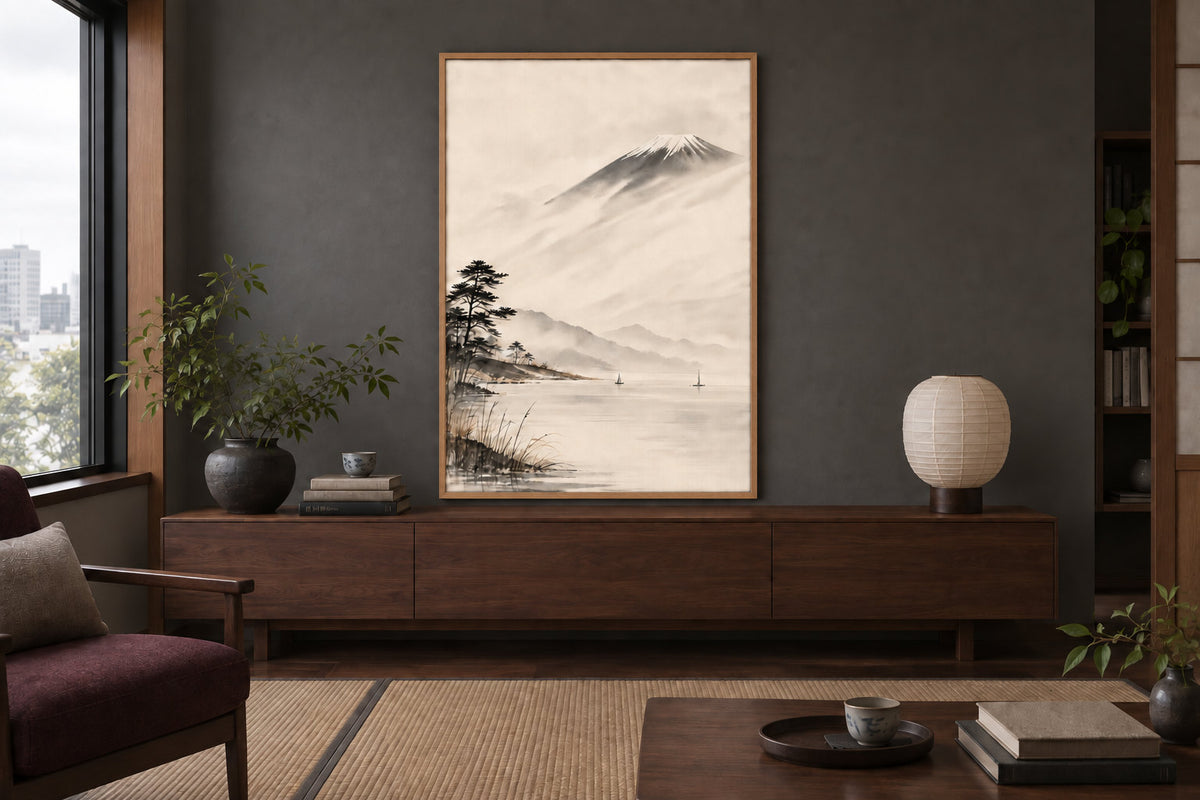
Light oak brings a touch of wood around the image. Black creates a more visible boundary and can echo dark lines in the subject. White can connect with pale window frames or other joinery. None of these frames belongs to only one family of prints.
The comparison below keeps the room and poster the same: only the frame colour changes. You can also compare the options in the composition tool, then check the chosen frame’s external dimensions to establish how much space it will take up at home.
What to hang beside it
A single image lets your gaze focus on its subject. Two or three pictures create a different rhythm. Align their centres or lower edges, then keep the gaps regular to connect different sizes without having to choose identical scenes.
A botanical print, a drawing or another Japan-inspired poster can provide a link through line or colour. A photograph or typographic print is also possible: look for a specific connection, then compare the group on the floor before drilling.
 Japan - The cranes in the reeds
View the poster
Japan - The cranes in the reeds
View the poster
 Japan - Misty Mount Fuji
View the poster
Japan - Misty Mount Fuji
View the poster
 Japan - Koi carp
View the poster
Japan - Koi carp
View the poster
 Japan - Traveler on the snowy bridge
View the poster
Japan - Traveler on the snowy bridge
View the poster
Keep your room’s own character
Light wood and linen are just one possibility. A dark sideboard, a colourful chair or an already full bookcase can accompany the picture just as well. Greens, blues and browns offer several directions, depending on the furniture you own.
Above all, check reflections from your viewing position. A lamp aimed at the glazing or a window facing the frame can make the image harder to see. Moving the lamp or frame slightly may be enough. Japandi decor can inspire your choice of materials without requiring a beige interior.
One image or three?
Japanese landscapes come in several orientations. Keep the orientation and framing of your chosen image. You can combine portrait and landscape works by arranging their centres or the group’s overall outline, rather than stretching the artworks to make them uniform.
Three portrait 30x40 posters with two 5 cm gaps occupy 100 cm before adding the frame mouldings. A single 50x70 can create a different effect in a living room or bedroom. Compare a 70x100 using a paper template too: the available viewing distance and furniture width matter more than a universal distance rule.
What we print and how it affects the result
We print to order on 270 gsm semi-matte photo paper, using pigment inks in our Fayence workshop. The result remains a print on paper: it does not reproduce the materials or physical relief of an antique print. Placement and the frame’s protection also contribute to the finished display.
Paper sizes are 21x30, 30x40, 50x70 and 70x100. Check the orientation and image of your chosen product. Contemporary Japan-inspired posters and reproductions of classic artworks offer two distinct directions: choose the image you will actually enjoy looking at every day.
Two other blog guides explore the next steps: matching a poster to your wall colour and choosing a frame for a 30x40 print. If you want a similarly restrained look beyond Japanese subjects, minimalist posters and black and white posters share that economical use of visual elements.
Japan-inspired posters
Landscapes, birds and Japanese compositions, printed to order in our Fayence workshop
Browse Japanese postersJapan-inspired posters, printed to order.
Browse Japanese posters

