

How do you choose photographic wall art for your interior?

A photographic image appeals to you on screen, but you are not sure how it will look at home. The subject matters, of course, as do the background, the size of details and the light on the wall. A close face is not viewed in the same way as a distant coast.
To choose your picture, begin with the spot where you will see it every day. We compare four compositions and two frame finishes, with guidance for distinguishing what the image tells from how it sits within the room.
Decide what you enjoy looking at in the scene
Ask what holds your attention: a gesture, light, silhouette or the texture of a wall. Photographic wall art includes very different compositions. A scene with several people invites you to examine their relationships; a single object gives more attention to shadows and surfaces.
Portraits and scenes with people let you choose a look or movement. Landscapes give more space to land, water and sky. Study the foreground as well as the background: a dark branch can become the image's main focus even when the product bears the name of a region.
Four compositions, four viewing distances
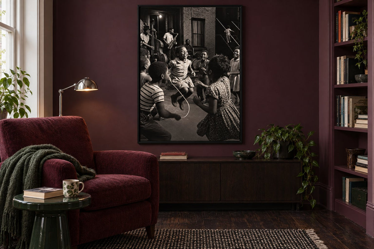
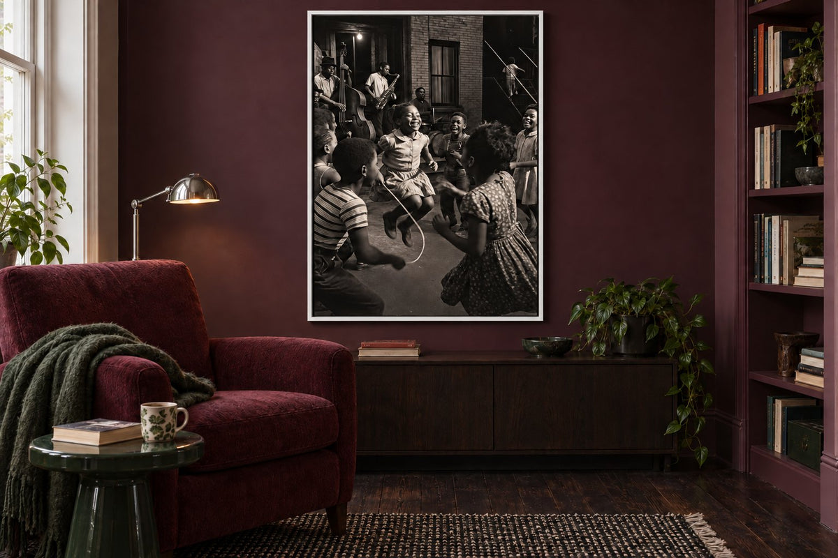
Skipping rope to a jazz beat gathers children around a skipping rope and musicians in a black and white scene. Faces and gestures deserve a position where you can get closer. The pine leaning over the gulf places a dark pine before a coast and mountain ridges receding into mist. The landscape remains readable as a whole, with fewer small elements demanding attention at first glance.
Provence - Under the arcades shows pale arches, plant shadows and an opening towards hills. Olive branch in a bowl, sun shadows brings a terracotta bowl, olive branches and their shadows closer. Architectural prints guide the eye through openings; olive tree prints let you compare leaves, pots and light. Choose between these structures before thinking only about your wall colour.
 Skipping rope to a jazz beatView the print
 The pine leaning over the gulfView the print
 Provence - Under the arcadesView the print
 Olive branch in a bowl, sun shadowsView the print
Consider movement and quieter areas
A musical scene contains several points of interest: instruments, hands, expressions and people in the background. It can become the principal image in a reading corner. Music prints offer further ideas if this subject is part of your everyday life. Leave enough clear space around the frame so that bookshelves and objects do not conceal the scene.
By contrast, a horizon or a shadow on a wall can accompany a room already full of books and textiles. Sea images and mountain landscapes vary in density: examine the scale of waves, trees and ridges. Even a restrained nature scene can contain many details.
Compare the outline in a dark room
The two simulations show the same plum reading corner, burgundy armchair and unchanged jazz scene. The black frame extends the image's dark areas and stays discreet on the wall. A white frame of identical dimensions creates a more visible outline, separating the photograph more clearly from the paint. Lighting and room composition remain identical.
The photograph is not being brightened: only its external finish changes. Black and white prints can therefore belong in a colourful room without requiring a monochrome interior. Compare frames and hanging accessories with the actual wall colour and nearby furniture. Choose the boundary you like rather than a finish supposedly compulsory for every photo.
Match the position to the details you enjoy
Beside an armchair, a detailed image can be discovered during a break. Across the living room, silhouettes and contrasts come first. Compare living room prints from your usual seat. Our guide to print size above a sofa helps you prepare templates without confusing the print format with the frame's overall dimensions.
At a desk, a still life can sit on a side wall you see when you look up. Office wall art is also chosen in relation to storage and screen reflections. During your trial, check that an open door or a lamp does not hide the subject.
Separate the light in the image from your room lighting
Strong sunlight in an image does not replace light in your room. Printed dark areas can merge when the wall is poorly lit; glazing can reflect a window and hide a face. Make your final trial at the times you actually use the room, looking from several positions.
Paper, printing and any protective glazing influence the result. Our prints use 270 gsm semi-matte photo paper and pigment inks. The guide to the difference between art paper and photo paper explains these terms. A paper category alone cannot guarantee no reflections from every position or colour identical to your screen.
Check the whole image and the version selected
Inspect all four edges, orientation and elements near the frame: a hand, tree or opening is part of the composition. Choose the version shown on the product page rather than imagining a different crop. A photographic appearance describes how an image looks; it does not by itself prove a date, exact location or documentary origin. Check these details if they matter to your purchase.
Affichely paper prints are produced to order in our Fayence workshop. Choose a scene you enjoy both for its subject and the way it is presented, then test its position with your belongings and lighting. An image chosen this way can be enjoyed for its details and its whole composition without reorganising the entire room around it.
An image worth a closer look
Portraits, landscapes and scenes for your interior
Discover photographic wall artChoose a scene that finds a place in your home.
Discover photographic wall art

