

Which Paris print will suit your interior?

You are looking for a Paris print, but the Eiffel Tower may not be what appeals to you most. Rooftops, a balcony or a Montmartre street can evoke the city more personally. Your choice also depends on the colours and objects already in your home.
Start with what you want to look at every day, then compare how it is drawn. Here are four directions for finding a Parisian image and giving it a place in your interior.
Choose between a landmark and an everyday detail
A recognisable landmark immediately identifies the subject. A window, roof or chimney invites a closer look and leaves more room for personal memories. In the Paris prints, consider this distinction first: do you want to recognise the city from the doorway or enjoy a small part of its atmosphere beside your armchair?
Landmark prints make the setting explicit; views of Montmartre follow the neighbourhood's stairs, façades and slopes. The subject need not record your latest trip. You can love a roofline without seeking an exact address, and prefer a drawn scene to a detailed representation of the whole city.
Four ways to bring Paris home
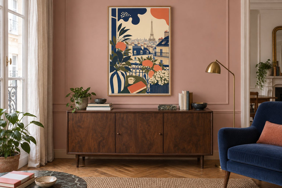
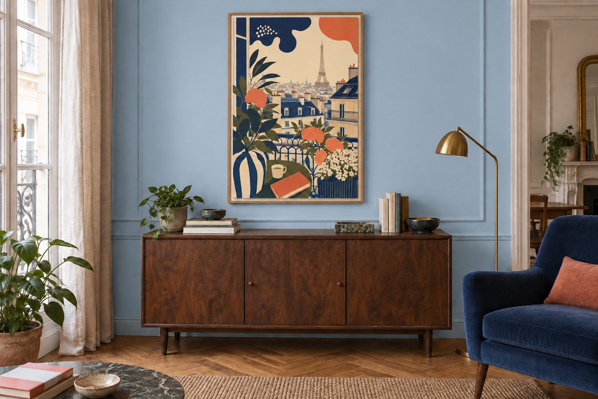
Paris - A balcony over the city places the Eiffel Tower behind a flower-filled balcony, with broad navy and coral shapes, a cup and a book. It combines a domestic scene with the city. Open Window over Montmartre looks towards Sacré-Cœur through a dark window: the frame drawn within the image organises the rooftops and creates a visual opening with few colours.
The Montmartre Staircase to the Sacré-Cœur follows steps up to the basilica with a flowing line and touches of grey. Rooftops and Chimneys of Montmartre moves closer to roofs and chimneys in cream and grey-blue tones. These views suggest different walks. Compare architectural prints with decorative illustrations to decide whether you particularly like the structure of the place, the drawing itself or the colour.
 Paris - A balcony over the cityView the print
 Open Window over MontmartreView the print
 The Montmartre Staircase to the Sacré-CœurView the print
 Rooftops and Chimneys of MontmartreView the print
Read the drawing alongside your furniture
A print filled with flowers and buildings can become the main pattern in a living room corner. It can accompany plain textiles, while a simpler drawing leaves more room for a patterned rug or armchair. Look at the image as a thumbnail: the shapes that remain visible indicate what will stand out from a distance.
Line drawings offer a different direction from intensely coloured scenes. If you have a second-hand sideboard, retro-inspired prints can echo its older character without requiring a period interior. Our guide to pairing a retro print with contemporary furniture helps preserve that personal mixture alongside your everyday objects.
The same balcony on pink and blue walls
The two simulations keep the walnut sideboard, blue armchair, lamp and the same balcony print in its oak frame. Only the wall paint changes. Pink brings the setting closer to the coral flowers; blue connects more directly with the rooftops and armchair. The image's presence changes without altering its drawing.
This comparison does not identify a winning colour. It shows two possible combinations with identical furniture. Blue prints can echo fabric or ceramics; orange prints create another relationship with wood. Before repainting, compare a sample in your own light and consider whether a small echo in the textiles already gives you the change you want.
Give the picture a place in the room
Above a sideboard, leave the lamp and books in position during your trial. A window image loses its effect if an object covers the lower part. Compare living room prints from your seat and then from the entrance: a small detail you enjoy close up can become secondary at the far end of the room.
A rooftop view can also accompany an entrance console. Hallway prints suggest options for spaces you walk through rather than contemplate at length. Make a template matching the frame's outside dimensions and check door clearance. Available space determines the format; a famous landmark does not automatically need a large print.
Combine Paris with other images without repeating the city
You can pair an urban view and a botanical drawing if a tone, line or finish connects them. Two nearly identical Eiffel Towers offer less variety than a rooftop and a balcony scene. City prints also let you bring several places together, provided you compare the images as a group before deciding how to hang them.
Our guide to decorating with travel prints explains how to choose that shared connection. Keep the crops different so that each image contributes something. A detailed composition can stand alone; you do not need to fill every space around the first picture or turn the wall into a collection of souvenirs.
Check the details that matter before ordering
Look at all four edges, the orientation and the version offered on the product page. An illustration evokes Paris through its drawing; it is not a geographical document. Choose frames and hanging accessories to suit the wall and the total weight, then check reflections under your usual lighting.
Affichely paper prints are made to order in Fayence on 270 gsm semi-matte photo paper with pigment inks. Choose an image you enjoy for its complete scene, rather than simply the name Paris. Its lines, colours and the place you give it will make it part of your everyday home.
Your view of Paris
Balconies, landmarks and rooftops to choose for your interior
Discover Paris printsFind a Parisian scene you enjoy every day.
Discover Paris prints

